“Can you help me contemporize my home by reframing some of my collection?”
This was the question posed to me by a potential new client. She has collected American Modernism for several decades and her walls are filled with many wonderful artworks. Living most recently in a high-floor modern building for several years she felt the overall ambiance of her home would be more pleasing if it had a more contemporary feel. She consulted with interior designer Tobi Wright; Tobi asked if the collector had considered the reframing of some of the artworks. Typical of many longtime collectors, she had purchased the artworks and never questioned the impact the frame had on the presentation of the art. The idea was a revelation to her.
After our initial phone conversation, I made a date to come meet her in her home to assess the situation. When I visited I was struck by the diversity and richness of the artworks, the use of vibrant wall colors in the home, and the dramatic floor-to-ceiling windows that constituted two of the four living room walls.
It was immediately apparent to me that many of the frames could be improved upon and that the current installation on the primary wall in the living room was crowded and grouped, so that I felt the artwork was detracted from rather than enhanced.
Living room ‘before’
I assured her that we could, indeed, effect a dramatic change by both reframing and reinstalling the primary wall that held many favorites in her collection.
The next step was to illuminate the possibilities in different forms and finishes of more modern frames; for this I suggested we make a trip to Michael Rosenfeld Gallery. I’d worked for the gallery recently and was intrigued by the purposeful and systematic reframing they have chosen to do over the past several years. Their approach was in response to the way new collectors responded to more contemporary surrounds. In addition to simplified profiles and the use of a float technique for mounting the art, most of the gallery’s frames have been finished in shades of white.
It was easy to see what a difference this made.
While my client quickly embraced the idea of simpler, more streamlined profiles, she was not keen on the use of white finishes. Happily, we were able to rely on the historical precedent of using silver gilded finishes for the frames and still accomplishing our goal of creating a more modern look. We also utilized float fittings for many of the artworks.
Detail showing the float style of fitting an oil on canvas
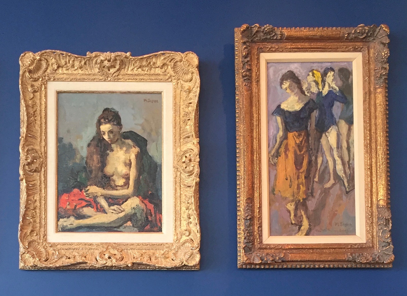
It should be noted that many of the existing frames were mid-20th century reproductions of French Louis–style frames that were not true to the Modernist aesthetic and many used linen liners, an outdated and unnecessary component of the framing treatments.
Detail showing two different ‘Louis style’ reproduction frames with linen liners.
It was a thrill to see all of the artworks transformed by their new frames and the float-style fittings.
‘Before’ frame on Blanche Lazell (Untitled), o/c, 1921
‘After’ showing Blanche Lazell painting in new silver gilded Modernist profile and float-style fitting
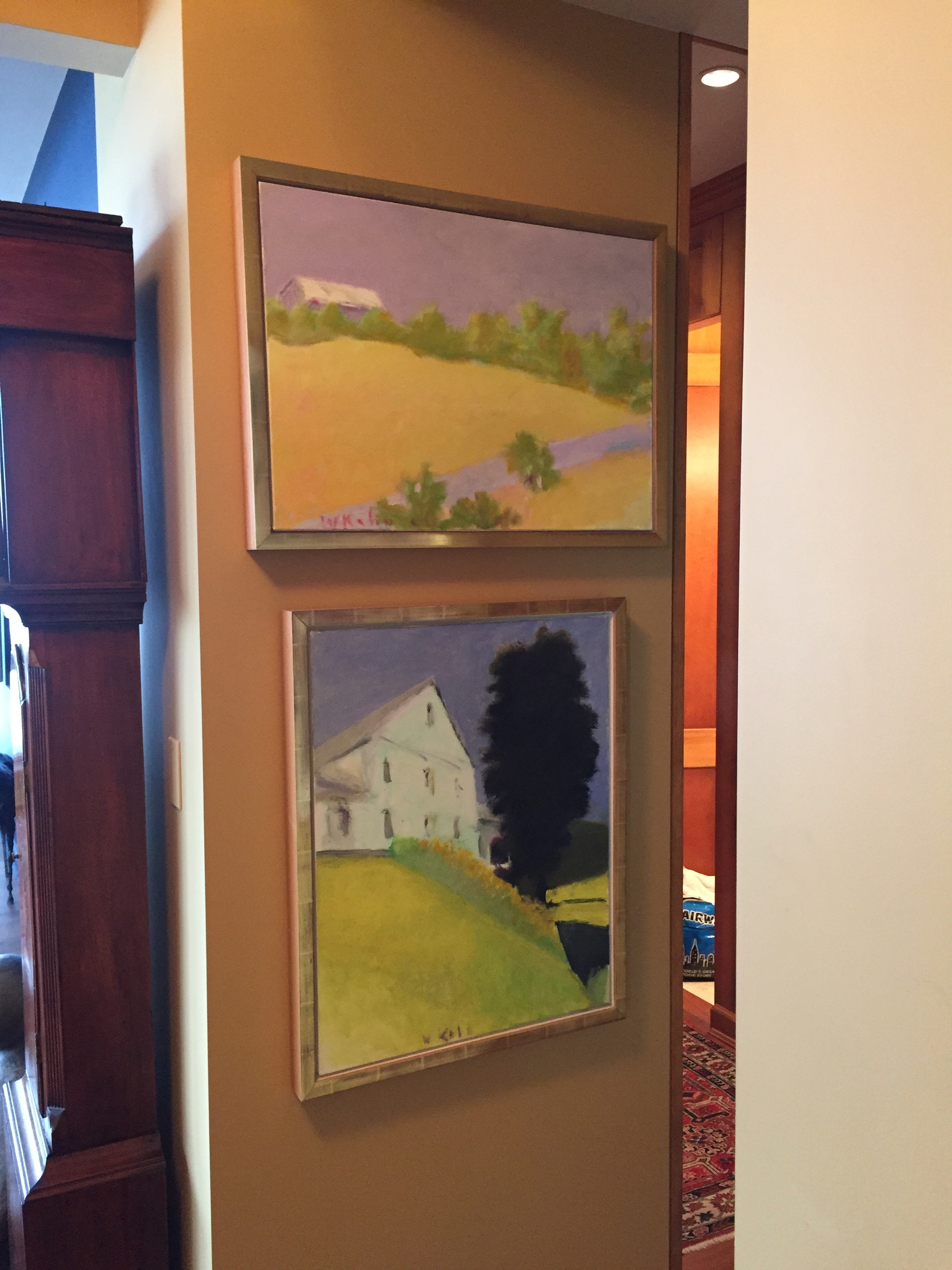
As we considered a new installation for the living room wall, we recognized that we had some challenges: first, this same wall, the only solid wall in the room, housed a recessed flat screen television and second, there were too many artworks for the space to do them all justice. Ironically, we solved this issue in part by considering artworks in other areas of the apartment for inclusion in the new grouping.
Two o/c paintings by Wolf Kahn in foyer area
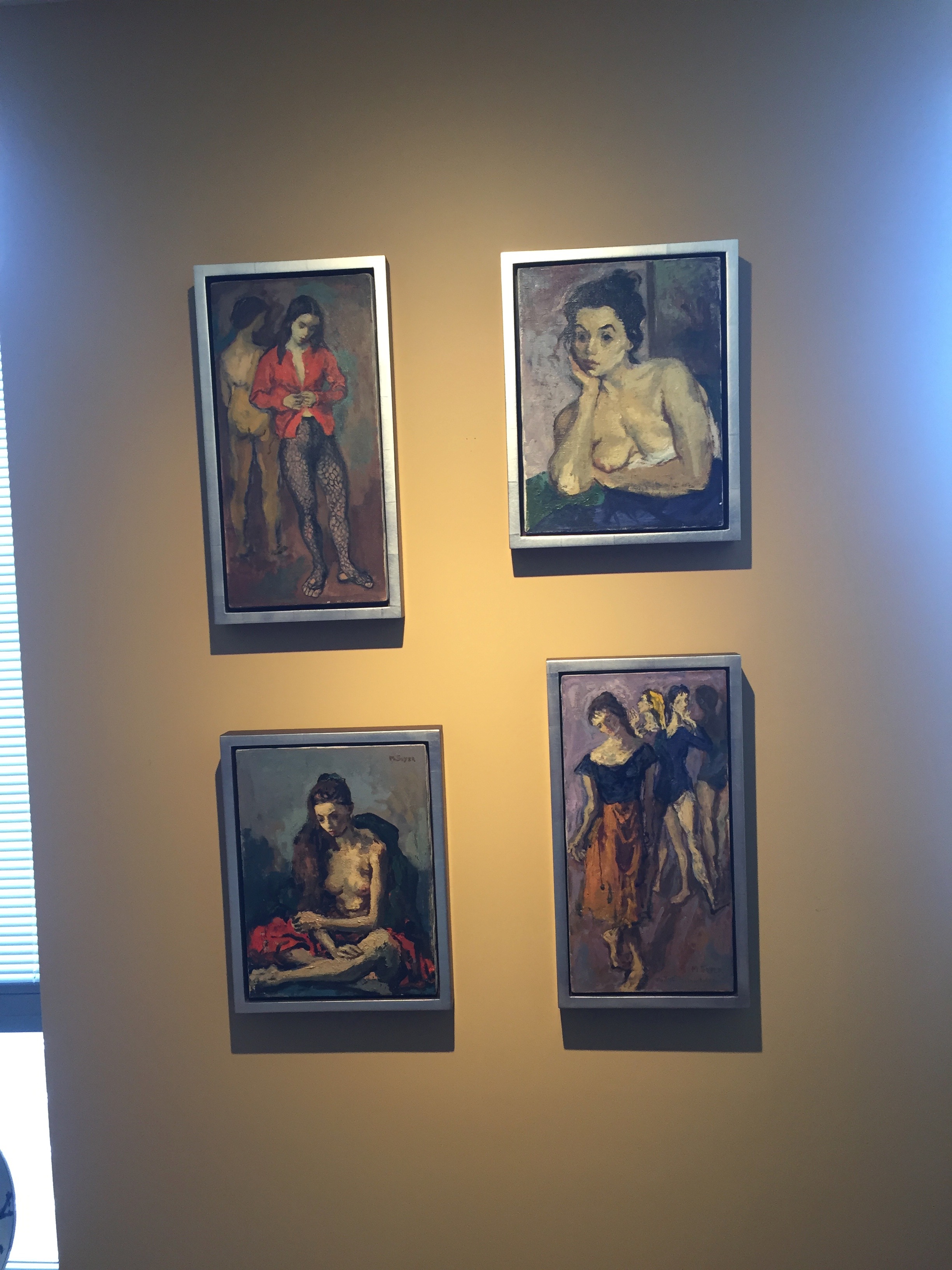
We also chose to approach the four small, related paintings by Moses Soyer as a single entity and to relocate them to their own wall in the dining room.
Four Moses Soyer paintings in new location with new frames and float-style fitting.
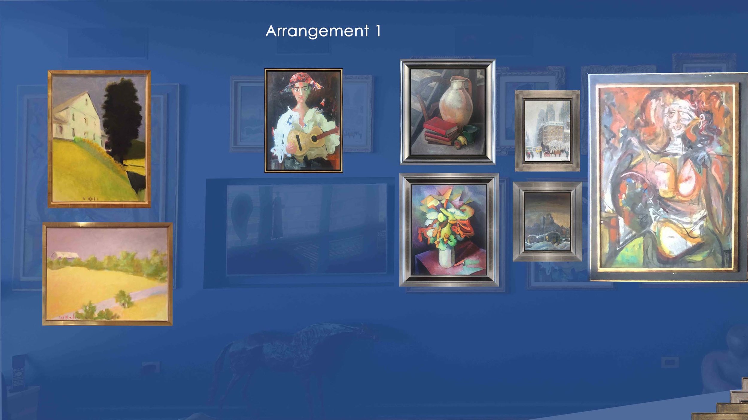
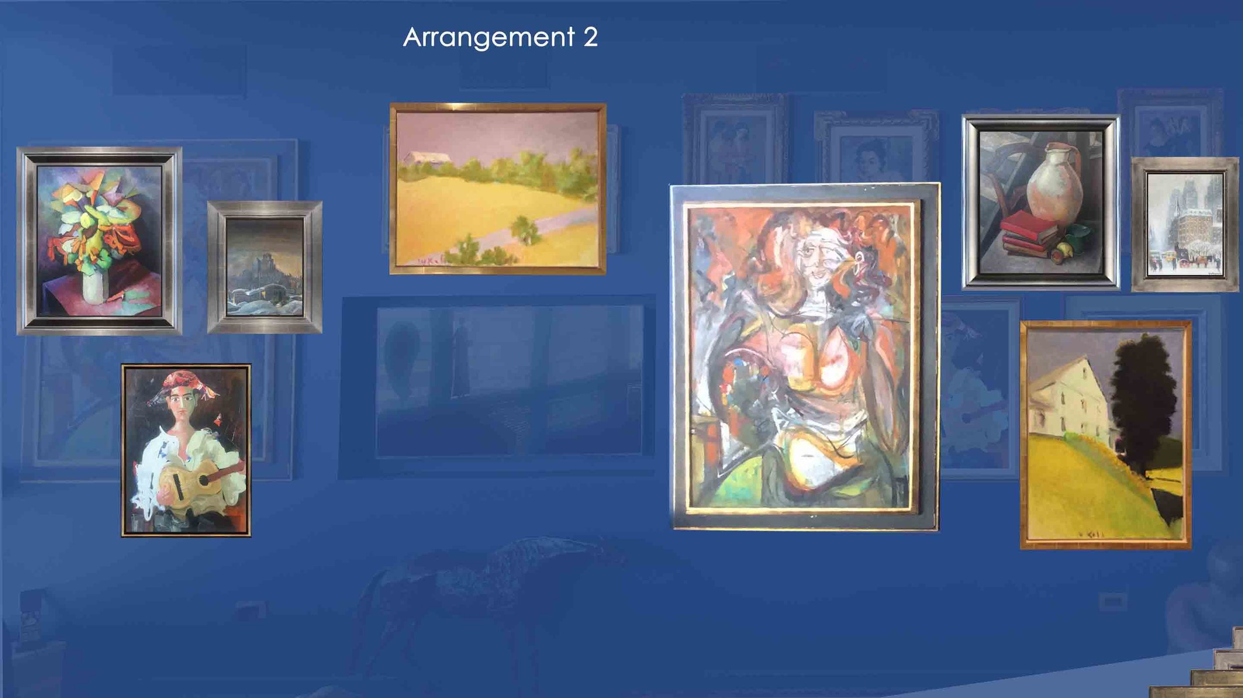
As part of our overall process we explored possible new arrangements digitally using Photoshop.
Digital layout Version 1
Digital layout Version 2
We all agreed we favored Version 4.
Digital layout Version 4
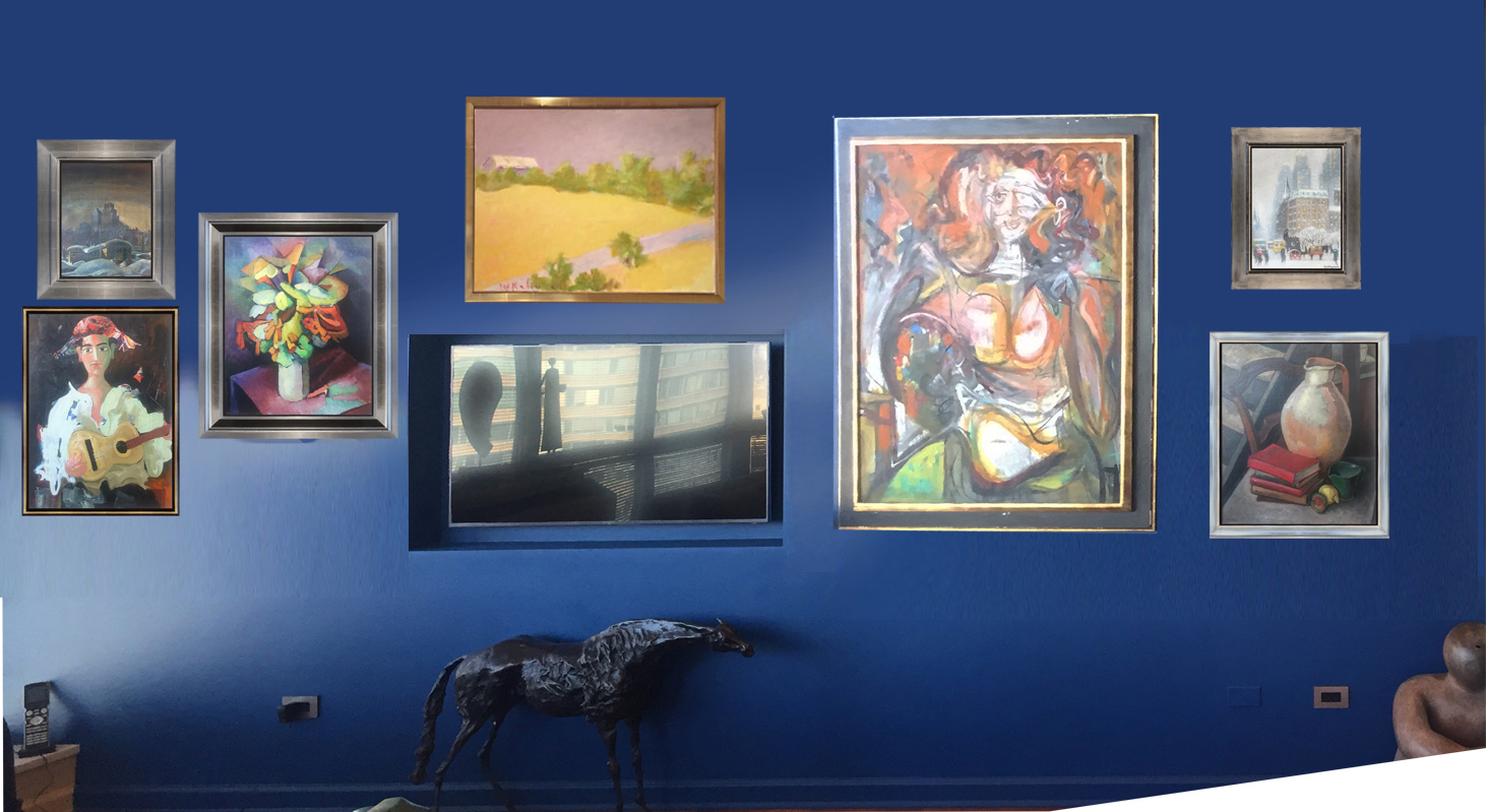
On installation day we hung the art as in Version 4; seeing it up on the wall the client felt that it didn’t look right having the two small paintings at the far right We arrived at the perfect layout by simply reversing their position with the single large painting by Byron Browne.
Living room wall ‘after’ with new frames and new installation
This has been such an interesting and gratifying project. After these many years of framing fine art, time and again, the transformative effect of a well-chosen frame inspires and impresses. It’s a privilege and a delight to work with collectors who find ever-evolving ways to enjoy and enhance their treasures. In the words of my client:
“Having been a collector for many years and a frequent, enthusiastic visitor to museums near and far, I was amazed to realize how little I knew about frames. One of the delights in working with Suzanne was her being my teacher—educating me about the history, value and importance of picture frames. Now, when I go to an exhibit, I look at the frames as well as the pictures, resulting in a richer viewing experience”.


