Framing John Marin

Originally published in Notes from a Visiting Scholar, Fall 2020, Menconi+Schoelkopf

marin-post-fig-9-banner.jpg

American modernist John Marin (1870-1953) explored the role of frames and his artwork extensively throughout his career. Marin both incorporated them figuratively within his compositions and utilized them literally to enhance and enclose his artworks. Marin was educated in engineering and practiced as an architect throughout the 1890’s, a perspective that surely informed his artistic practice and frame choices. Early simple frames that surround many of his early watercolors were finished in nuanced shades of white and others were gilded in tones of silver. Later in his career, from the 1930’s onward, Marin created surprising, unusual frames, some modest wood profiles that he painted with patterns and colors related to the artwork and others that included driftwood and other found materials.  These later frames by themselves may seem humble and unsophisticated, yet when united with Marin’s artworks, they add dramatic and compelling visual interest.

We are fortunate to know a great deal about Marin’s framing practices. Two publications in particular devote valuable attention to Marin’s frames. The first is Ruth E. Fine’s book John Marin of 1990. In addition to her discussion of Marin’s frames [1], many of Marin’s artworks are illustrated in color in their original frames throughout the book. The second book John Marin’s Watercolors: A Medium for Modernism includes a chapter that details the thorough investigation and analysis of the framing treatments on seventeen Marin watercolors and two oils spanning the years 1914-1947; retaining their original framing treatments [2], most had been gifted to the museum in 1949 by Georgia O’Keeffe as the executrix of the Estate of Alfred Stieglitz. 


Marin’s early frames were made by George F. Of a frame shop founded by George F. Of, Sr. [3]. George F. Of, Jr. (1876-1954), an artist in his own right, worked in his father’s shop as a boy and took over the business upon the death of his father in 1905 [4]. Alfred Stieglitz had been working with George F. Of at least by 1902 - the inaugural issue of Camera Work from January 1903 contains a banner ad for George F. Of that lists the address 3 East 28th Street; in the same issue under ‘Some News Things Worth Looking Into’ it notes “The new store of Geo. F. Of, whose framing of photographs has added to the admiration expressed for many of the American prints.” It was from the 28th Street address that in 1915 Of relocated to 274 Madison Avenue (between 39th & 40th Streets), much closer to Stieglitz’s Gallery 291 located at Madison Avenue between 40th and 41st Streets.

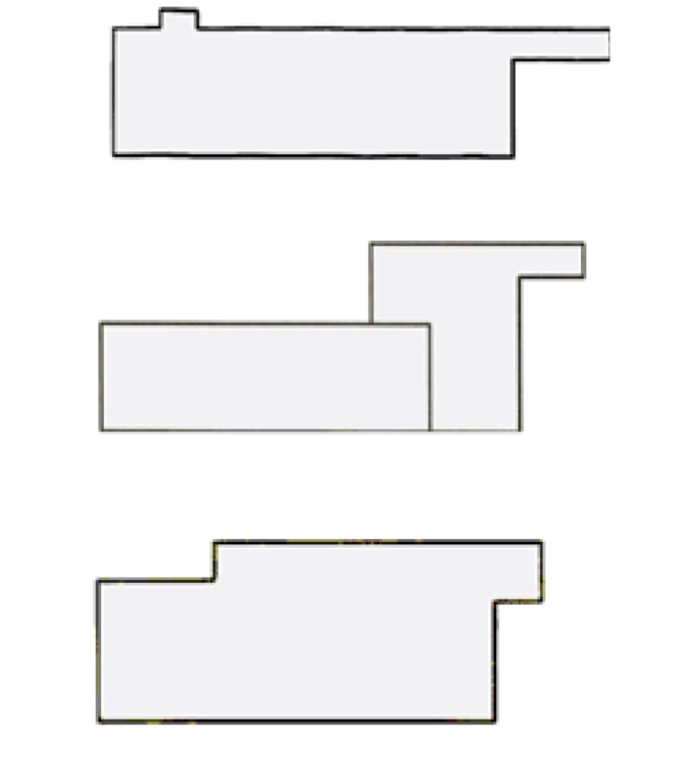
Fig 1 Step frame profiles. Courtesy Menconi + Schoelkopf 

Fig 1 Step frame profiles. Courtesy Menconi + Schoelkopf

Fig 2 Replicating the George Of white frames of the period, translucent washes of blue, green, and gray have been applied to this reproduction white frame on Little Fir Tree, Deer Isle, 1921. Courtesy Menconi + Schoelkopf 

Fig 2 Replicating the George Of white frames of the period, translucent washes of blue, green, and gray have been applied to this reproduction white frame on Little Fir Tree, Deer Isle, 1921. Courtesy Menconi + Schoelkopf

Among several profiles that Marin favored in the 1910’s were several iterations of  ‘step’ frames. (Fig 1) Often finished in silver leaf, these are frequently seen on Marin watercolors and paintings. Interestingly, in addition to the more well-known silver-gilded frames, there are a number of other original Of frames that are finished in white. Not just any white- as detailed in the Chicago book, Of utilized a variety of surface treatments where white enamel paint has been modified by the use of specific colors underneath and also translucent washes of blue, green and gray on the outside (sometimes added by Marin himself) that speak directly to the colors in each individual watercolor. (Fig 2)

An invoice [5] from Of to Stieglitz shown in the Chicago book for the ‘Marin account’ enumerates many different frames ordered with drawings of their profiles and notes regarding their finishes that include both silver leaf and ‘cool white enamel’. The framemaker’s invoice is on letterhead listing the address ‘274 Madison Avenue’ but this has been marked out and a stamp at left shows the shop has relocated to 126 West 57th Street. This tells us that the invoice is from July 1926 or later when city records list Of at the new address. These addresses and their corresponding dates illuminate how long Marin chose to use certain frame profiles and finishes.

Working with Menconi + Schoelkopf to effectively frame a number of Marin artworks has offered fascinating opportunities. Marin’s Weehawken Series, executed 1910-1916, and comprised of about 100 oil paintings all in small formats (12” X 8”, 14” X 10”, etc.) range from abstraction to figuration and employ dazzling color and brushwork. When asked to propose a frame for a significant group of the series I immediately thought of the range of ‘step frames’ that Marin and other artists used during these years and beyond. This approach honors Marin’s early frame choices and stylistically situates them in the early teens when they were painted. 

Fig 3 Detail of a silver leaf Weehawken Sequence frame. Courtesy Menconi + Schoelkopf 

Fig 3 Detail of a silver leaf Weehawken Sequence frame. Courtesy Menconi + Schoelkopf

Fig 4 A framed Weehawken Sequence painting. Courtesy Menconi + Schoelkopf 

Fig 4 A framed Weehawken Sequence painting. Courtesy Menconi + Schoelkopf

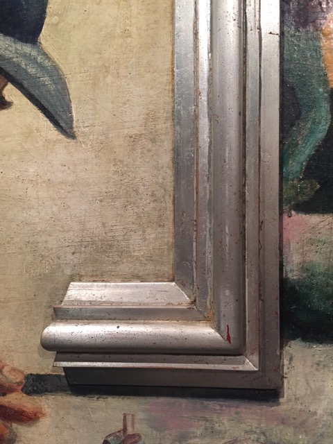
After considering several iterations we settled on a step profile 3” wide, with the primary wide flat closest to the opening of the frame. (Fig 3) The nuance of any surface, whether painted or gilded, is critical to a successful frame treatment and this is especially true when framing art of the early 20th Century. We settled on silver leaf that was then toned with a translucent colored wash that complemented the paintings. The result was just right. (Fig 4)

Fig 5 Before and after reframing of Street Movement, Nassau Street, No. 1. Courtesy Menconi + Schoelkopf

Fig 5 Before and after reframing of Street Movement, Nassau Street, No. 1. Courtesy Menconi + Schoelkopf

Fig 6 Light silver leaf finish and silver finish with a carefully toned wash. Courtesy Menconi + Schoelkopf 


Fig 6
Light silver leaf finish and silver finish with a carefully toned wash. Courtesy Menconi + Schoelkopf

Another example illustrating the importance of the finish was the reframing of  Street Movement, Nassau Street, No. 1 of 1936. The drawing/watercolor had been framed in a reproduction of an early Marin profile but was finished in a warm yellow gilding with no mat. Both the warm tones of the gold and the compressed border around the image constrained the overall effect. Instead, a narrow mat, in a color more congruent with the color of paper that grounds the image, was added and a less-wide style of step frame was chosen that employs one wide, recessed frieze - a simple profile that provides the perfect foil to the dynamic energy of Marin’s drawing of downtown New York City. (Fig 5) In this case, although still using silver leaf, the finish was carefully toned with a wash that gave the surface a darker, pewter shade that is supportive of the darker tones in the composition and still retains the elegant luster of a gilded surface. (Fig 6)

Marin’s later frames are remarkable for their inventiveness and originality. Marin made use of several different profiles for his later frames. Some were simple, others more complex. Some with painted surfaces to match the compositions and others chip-carved and embellished with shapes and lines that reinforced the same features in his artworks. In his eighties Marin remarked “If I were younger, I’d plunge into sculpture, but my frame-making will have to satisfy my sculptural urges” [6]. 

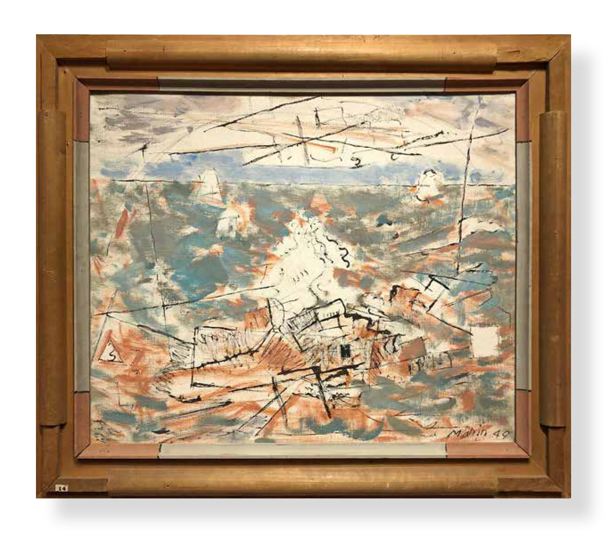
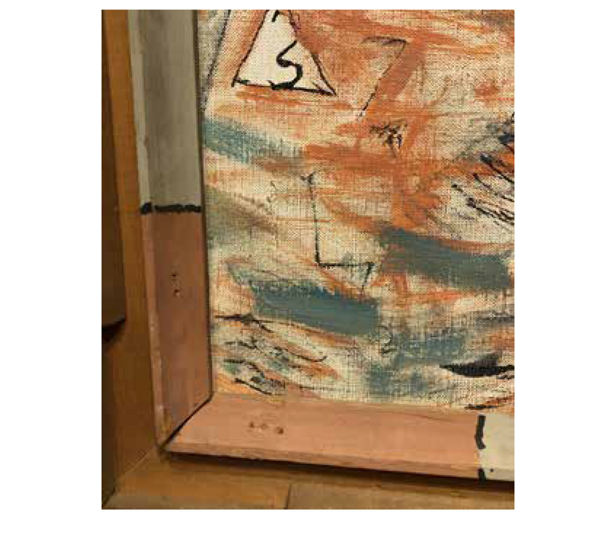
One such example is the frame original to Movement in Red and Grey No. 1 of 1949. (Fig 7) By leaving most of the wood surface in its natural state the warm tones speak directly to the colors in the composition. Further grounding the artwork within its surround Marin has painted all four inner sections of the frame with a central passage of the same pale grey in the composition and asserted the edges with a black calligraphic line that echoes those within. (Fig 8)

Fig 7 Movement in Red and Grey No. 1 in its original frame from 1949. Courtesy Menconi + Schoelkopf 

Fig 7 Movement in Red and Grey No. 1 in its original frame from 1949. Courtesy Menconi + Schoelkopf

Fig 8 Detail of original frame showing pale gray and black calligraphic lines. Courtesy Menconi + Schoelkopf 

Fig 8 Detail of original frame showing pale gray and black calligraphic lines. Courtesy Menconi + Schoelkopf

While striking in their effect and clearly a component of the artist’s aesthetic vision many of the frames made by Marin were removed from his artworks over previous decades.  As early as 1963 framer Henry Heydenryk remarked on the practice of artists painting their frames and noted that Marin had done so “…so forcefully and assiduously that the coloring and patterns on the frame became too dominant for the painting in it. Many owners have replaced his frames with more restrained, more neutral moldings” [7].

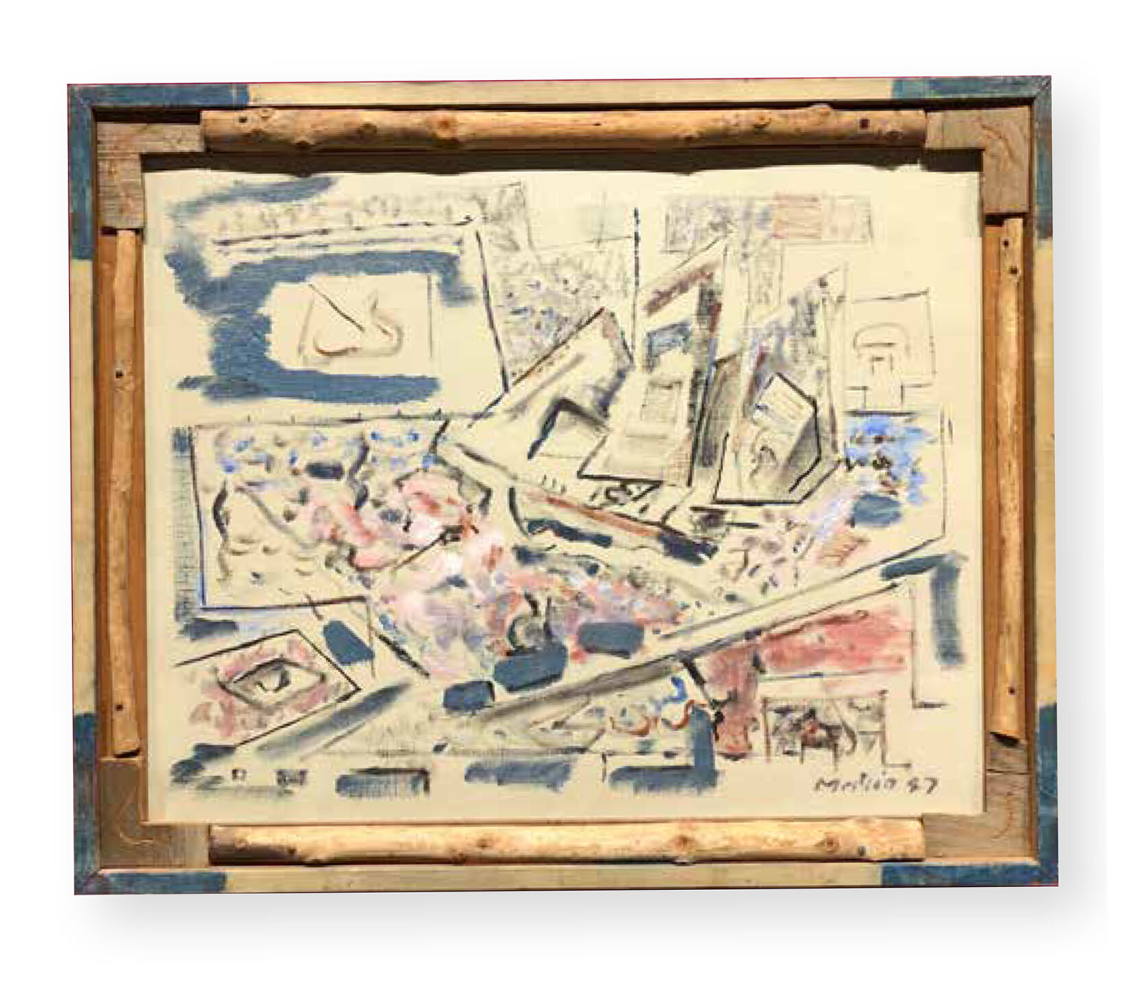
Fig 9 Movement: Sea Played with Boat Motive, 1947, in one of Marin’s original driftwood frames. Courtesy Menconi + Schoelkopf

Fig 9 Movement: Sea Played with Boat Motive, 1947, in one of Marin’s original driftwood frames. Courtesy Menconi + Schoelkopf

Happily, some of these frames have survived and were acquired by Menconi+Schoelkopf  so that they could be repatriated with Marin artworks. One such example is the marriage of Movement: Sea Played with Boat Motive, 1947 with one of Marin’s ‘driftwood’ frames. (Fig 9) The frame is narrow and anchored by corners painted in blue; narrow lengths of driftwood are affixed to each frame section with unapologetically visible screws. Each inner corner contains an ‘L’ shaped bit of coarse wood that is scored with a undulant line much like those on the canvas.  Though not original to this particular artwork the match is not only successful but revelatory-a telling example of the transformation affected by the use of the artist-made frame. 

Marin artworks embraced by Marin frames become something more, calling to mind the 1937 observation by critic Ralph Flint, “He has done a neat trick in framing…in an arrangement of weathered strips picked off the beach in Cape Split…a frame that will have its place in present-day Americana as sure as collectors are collectors” [8].

NOTES

1. Fine, Ruth E., John Marin, National Gallery of Art, Washington, D.C., Abbeville Press Publishers, New York, 1990. 201–207
2. Tedeschi, Martha and Kristi Daum et. al., John Marin’s Watercolors: A Medium for Modernism, The Art Institute of Chicago, Yale University Press, 2010. 58–77
3. George Ferdinand Of, Sr. (unknown birthdate-d.1905) immigrated to the US from Germany in 1867 and founded the shop in New York in 1873.
4. Of Jr. studied at the Art Students League for five years beginning in 1893 and spent a year with Abbott Thayer on his Dublin, NH farm in 1900. Later that year Of, Jr. accompanied the Thayer family to Italy and visited relatives in Germany, studied briefly in Munich and Paris and returned to courses at the League. Of, Jr.’s paintings were championed by many including Walter Pach though it seems that the demands of running a successful frame shop limited his career as a painter.
5. Alfred Stieglitz/Georgia O’Keeffe Archive, Yale Collection of American Literature Bienecke Rare Book and Manuscript Library, New Haven Connecticut.
6. Gertrude Benson, “82 Year Old Man Tells Artist’s Credo,” Philadelphia Inquirer, July 6, 1952.
7. The Art and History of Frames, Henry Heydenryk, James H. Heineman, Inc. 1963, pg 98.
8. Ralph Flint “John Marin Blazes New Trails,” The New York Sun, 6–16, 1937.

Reframing of a Theodore Roszak gouache

Theodore Roszak, City Forms, 1937, gouache, watercolor and collage on board; 29 1/8” X 24 1/8”. Menconi + Schoelkopf

Theodore Roszak, City Forms, 1937, gouache, watercolor and collage on board; 29 1/8” X 24 1/8”. Menconi + Schoelkopf

A gratifying recent project was the reframing of a gouache by Theodore Roszak (1933-2011) for Menconi + Schoelkopf.

Almost immediately upon seeing Roszak’s composition City Forms of 1937 I thought of a specific profile that would be perfect for the painting. The profile was designed in 1930 by the Austrian-born architect Joseph Urban for Thomas Hart Benton’s American Today mural. (See my blogpost about that project here.) 

The profile is an elegant combination of angles and a central half-round that speak directly to Roszak’s forms. Finished in silver leaf to best complement the lush blues,  the finish further affirms the modern world depicted.

DETAIL Thomas Hart Benton America Today, 1930-31; Metropolitan Museum of Art, Gift of AXA Equitable, 2012

DETAIL Thomas Hart Benton America Today, 1930-31; Metropolitan Museum of Art, Gift of AXA Equitable, 2012

Contemporary model of the profile designed for Benton’s America Today by Joseph Urban as seen in cross-section.

Contemporary model of the profile designed for Benton’s America Today by Joseph Urban as seen in cross-section.

"Can you help me contemporize my home by reframing some of my collection?"

“Can you help me contemporize my home by reframing some of my collection?”

This was the question posed to me by a potential new client. She has collected American Modernism for several decades and her walls are filled with many wonderful artworks. Living most recently in a high-floor modern building for several years she felt the overall ambiance of her home would be more pleasing if it had a more contemporary feel. She consulted with interior designer Tobi Wright; Tobi asked if the collector had considered the reframing of some of the artworks. Typical of many longtime collectors, she had purchased the artworks and never questioned the impact the frame had on the presentation of the art. The idea was a revelation to her. 

After our initial phone conversation, I made a date to come meet her in her home to assess the situation. When I visited I was struck by the diversity and richness of the artworks, the use of vibrant wall colors in the home, and the dramatic floor-to-ceiling windows that constituted two of the four living room walls.

It was immediately apparent to me that many of the frames could be improved upon and that the current installation on the primary wall in the living room was crowded and grouped, so that I felt the artwork was detracted from rather than enhanced.

Living room ‘before’

Living room ‘before’

I assured her that we could, indeed, effect a dramatic change by both reframing and reinstalling the primary wall that held many favorites in her collection.

The next step was to illuminate the possibilities in different forms and finishes of more modern frames; for this I suggested we make a trip to Michael Rosenfeld Gallery. I’d worked for the gallery recently and was intrigued by the purposeful and systematic reframing they have chosen to do over the past several years. Their approach was in response to the way new collectors responded to more contemporary surrounds. In addition to simplified profiles and the use of a float technique for mounting the art, most of the gallery’s frames have been finished in shades of white. 

It was easy to see what a difference this made.

While my client quickly embraced the idea of simpler, more streamlined profiles, she was not keen on the use of white finishes. Happily, we were able to rely on the historical precedent of using silver gilded finishes for the frames and still accomplishing our goal of creating a more modern look. We also utilized float fittings for many of the artworks. 

Detail showing the float style of fitting an oil on canvas

Detail showing the float style of fitting an oil on canvas

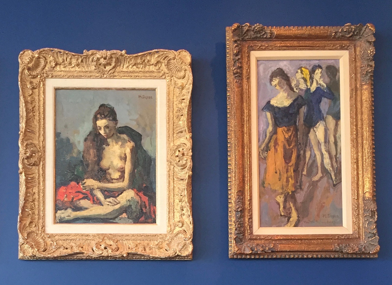
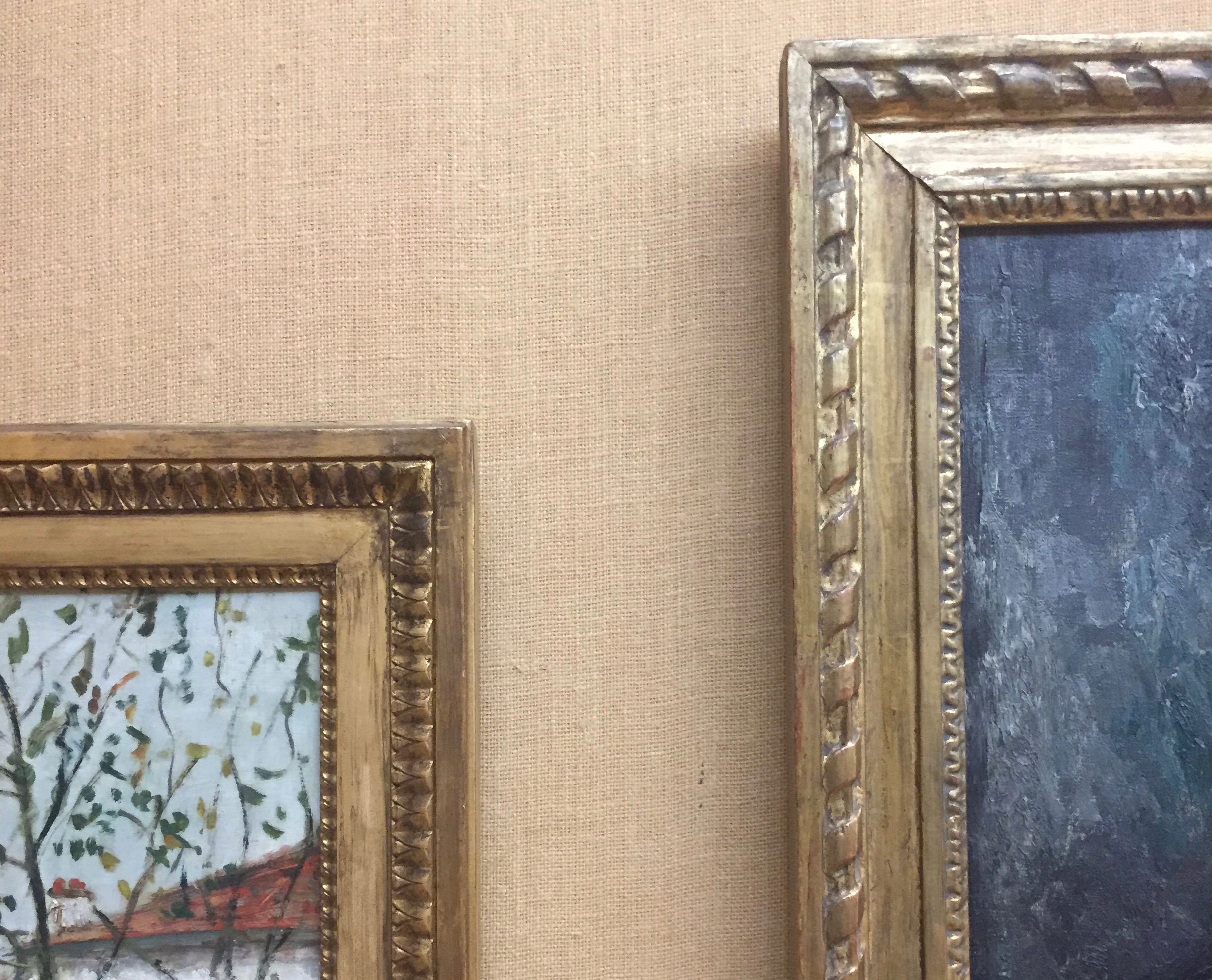
It should be noted that many of the existing frames were mid-20th century reproductions of French Louis–style frames that were not true to the Modernist aesthetic and many used linen liners, an outdated and unnecessary component of the framing treatments. 

Detail showing two different ‘Louis style’ reproduction frames with linen liners.

Detail showing two different ‘Louis style’ reproduction frames with linen liners.

It was a thrill to see all of the artworks transformed by their new frames and the float-style fittings. 

‘Before’ frame on Blanche Lazell (Untitled), o/c, 1921

‘Before’ frame on Blanche Lazell (Untitled), o/c, 1921

‘After’ showing Blanche Lazell painting in new silver gilded Modernist profile and float-style fitting

‘After’ showing Blanche Lazell painting in new silver gilded Modernist profile and float-style fitting

As we considered a new installation for the living room wall, we recognized that we had some challenges: first, this same wall, the only solid wall in the room, housed a recessed flat screen television and second, there were too many artworks for the space to do them all justice. Ironically, we solved this issue in part by considering artworks in other areas of the apartment for inclusion in the new grouping.

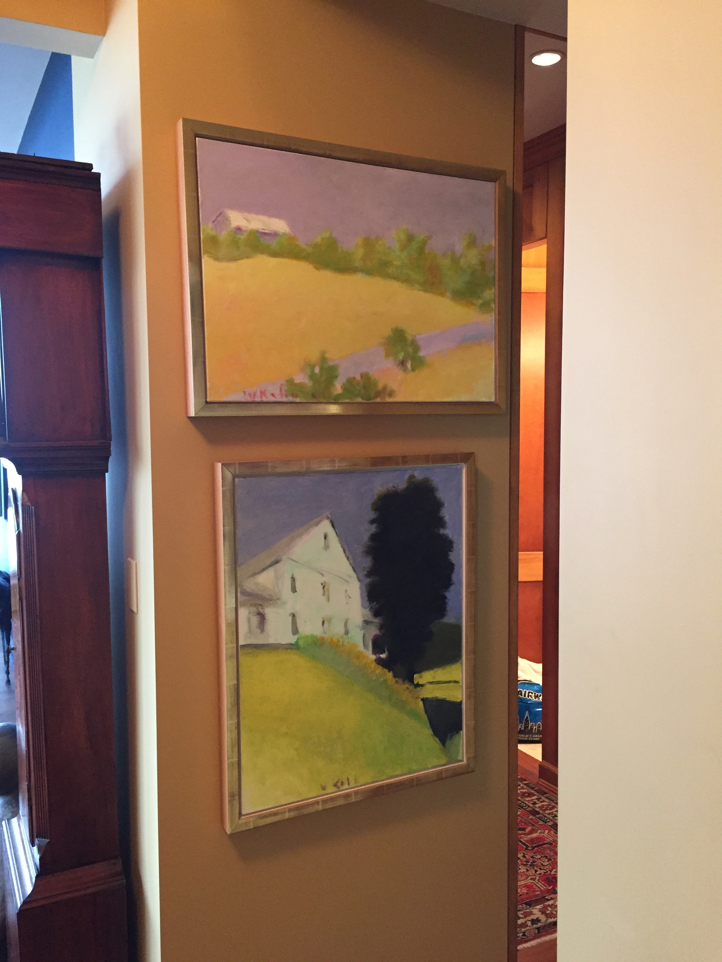
Two o/c paintings by Wolf Kahn in foyer area

Two o/c paintings by Wolf Kahn in foyer area

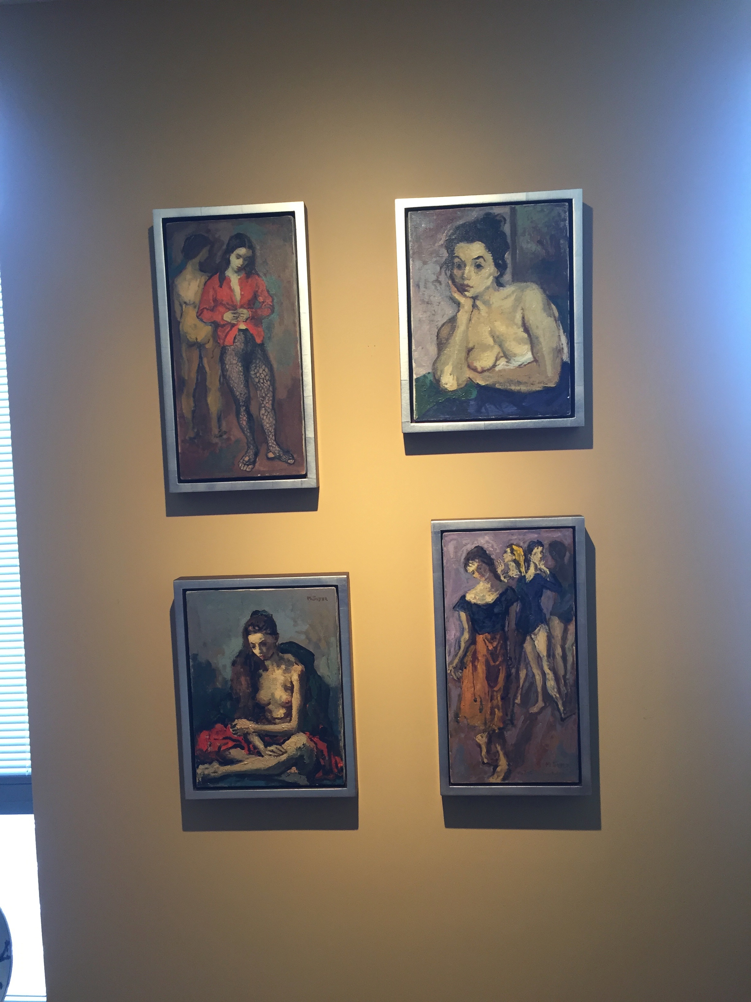
We also chose to approach the four small, related paintings by Moses Soyer as a single entity and to relocate them to their own wall in the dining room.  

Four Moses Soyer paintings in new location with new frames and float-style fitting.

Four Moses Soyer paintings in new location with new frames and float-style fitting.

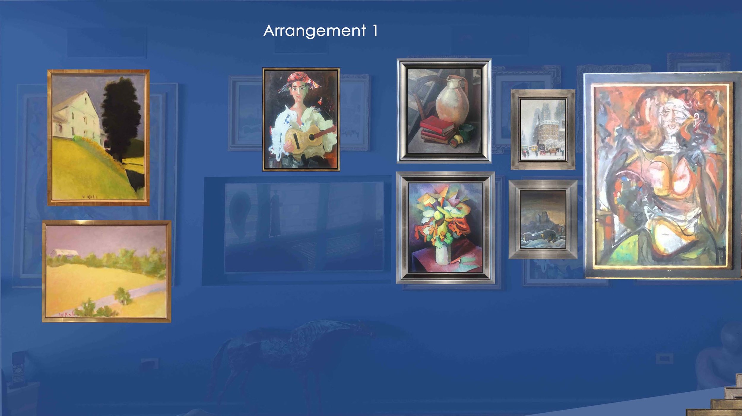
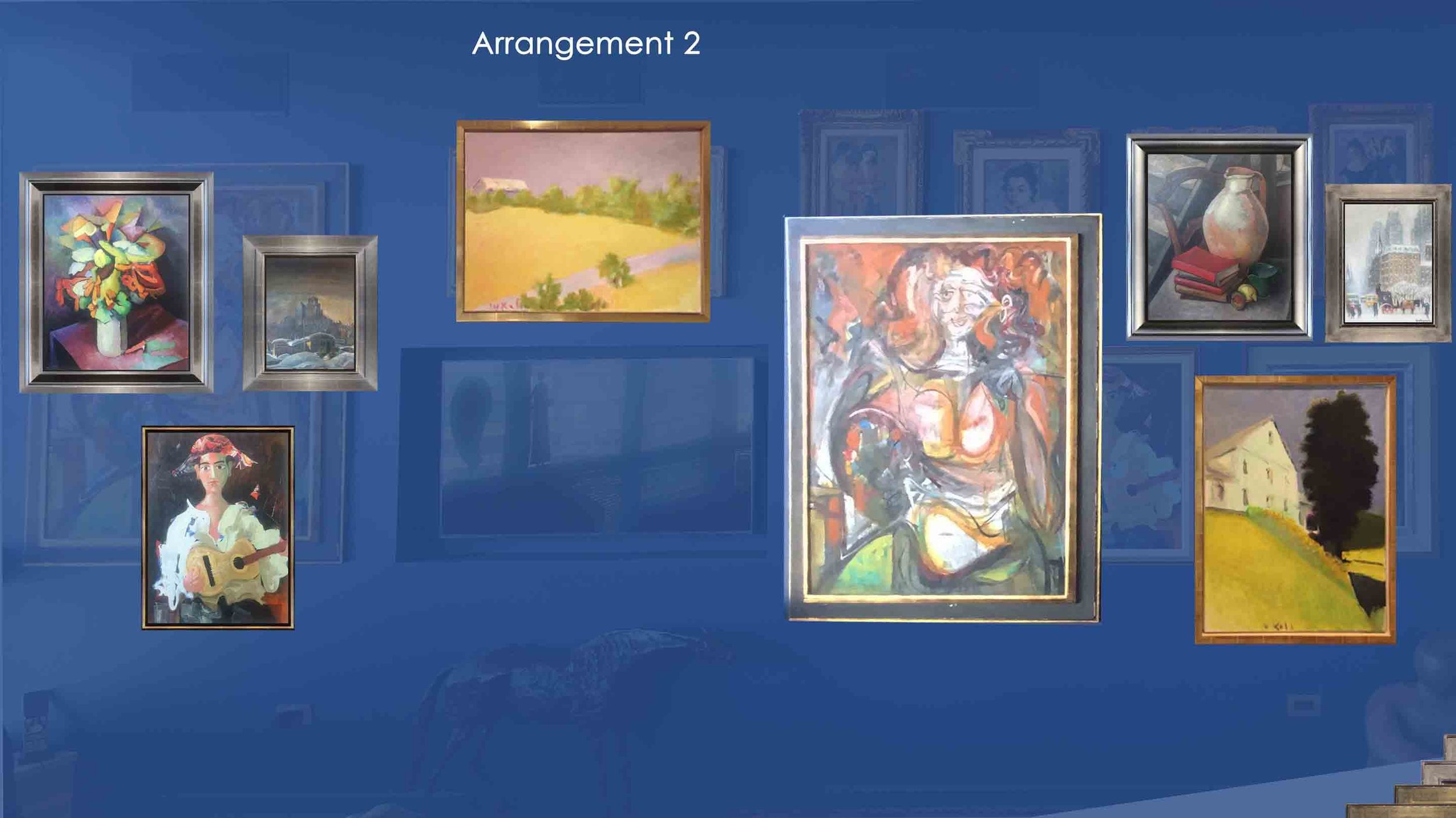
As part of our overall process we explored possible new arrangements digitally using Photoshop. 

Digital layout Version 1

Digital layout Version 1

Digital layout Version 2

Digital layout Version 2

We all agreed we favored Version 4. 

Digital layout Version 4

Digital layout Version 4

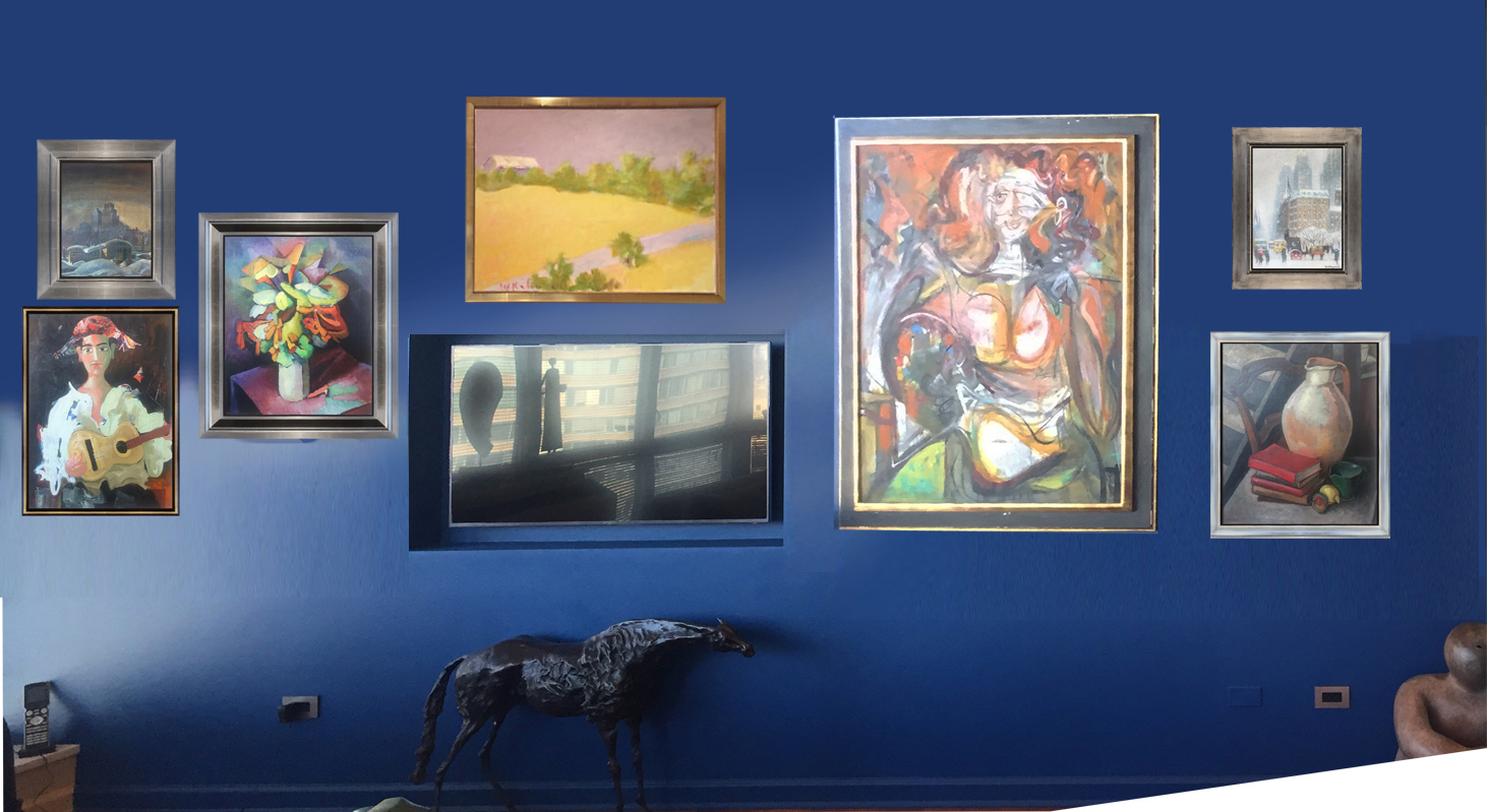
On installation day we hung the art as in Version 4; seeing it up on the wall the client felt that it didn’t look right having the two small paintings at the far right  We arrived at the perfect layout by simply reversing their position with the single large painting by Byron Browne. 

Living room wall ‘after’ with new frames and new installation

Living room wall ‘after’ with new frames and new installation

This has been such an interesting and gratifying project. After these many years of framing fine art, time and again, the transformative effect of a well-chosen frame inspires and impresses. It’s a privilege and a delight to work with collectors who find ever-evolving ways to enjoy and enhance their treasures. In the words of my client:

“Having been a collector for many years and a frequent, enthusiastic visitor to museums near and far, I was amazed to realize how little I knew about frames. One of the delights in working with Suzanne was her being my teacher—educating me about the history, value and importance of picture frames. Now, when I go to an exhibit, I look at the frames as well as the pictures, resulting in a richer viewing experience”.

Barnes Foundation Lecture

This past October 2017 I had the pleasure of presenting a Members-Only lecture for the Barnes Foundation.

The presentation focused on Dr. Albert Barnes’ framing choices, how he made those selections, who provided them and the three American artist-framemakers he patronized.

View of an ensemble at the Barnes Foundation

View of an ensemble at the Barnes Foundation

The archives at the Barnes Foundation is a treasure trove of information and includes Dr. Barnes’ extensive correspondence. (Happily the doctor’s letters were all typewritten.) That said, it was also a delight to see handwritten letters and even a frame-centric letterhead belonging to Robert Laurent.

Letterhead on an invoice for frames from Robert Laurent to Dr. Alfred Barnes

Letterhead on an invoice for frames from Robert Laurent to Dr. Alfred Barnes

In his early years of collecting Barnes worked extensively with noted French dealer Paul August Durand-Ruel so much so that in 1915 Barnes wrote to Durand-Ruel “…my collection is practically an annex of your business.”  There is frequent discussion of the frames on the artworks Barnes was purchasing from Durand-Ruel that make it clear Barnes was attuned to the impact of frames. On April 12, 1912 Barnes wrote “I hope you will agree with me that paintings such as I have bought from you should be furnished in frames that are worthy of the paintings, and fitting to be hung in the surroundings that they would find in my residence. If the frames which you have are old, dilapidated and inappropriate, I would prefer not to receive them, and believe that I am not asking too much of you to see that I am provided with suitable frames for the paintings in question.” And two days later on  April 13, 1912, “The reason I write you about these frames is that a number of other paintings…obtained from various dealers in Paris, were provided with frames which would be a disgrace to even mediocre paintings. I have been compelled to discard these frames, and order new ones in keeping with the character of the paintings and setting in my residence where they are to be placed.”

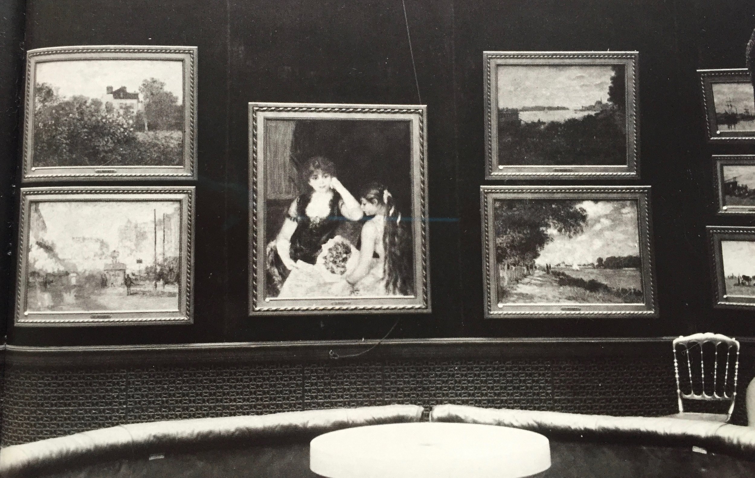
Invoices and receipts in the archive show that Barnes purchased both (more costly) period frames in a variety of French ‘Louis’ frame styles. It is interesting to note that in France by the mid 19th century there was a revival of interest in the18th Century and artists such as Fragonard, Watteau and Boucher (including the Louis-style frames used on them) and it was followed by a renewed interest, by the 1880’s and 90’s, in the applied and decorative arts of the same period. Hence, 18th Century Louis style frames were seen on French Impressionist artworks; this retrograde approach was especially popular among American industrialists with their newfound fortunes: all things European were seen as a reflection of their Cosmopolitanism. (The prevalence of such frames on 19th and early 20th Century artworks is a topic unto itself.)

View of French Impressionist paintings in the Lehman Collection at the Metropolitan Museum of Art showing the taste for earlier French ‘Louis style’ frames.

View of French Impressionist paintings in the Lehman Collection at the Metropolitan Museum of Art showing the taste for earlier French ‘Louis style’ frames.

French Louis frames range in the extent of their ornamentation to include curvaceous Louis XV designs 

as well as the more restrained, Neoclassical Louis XVI style.

View of restrained, classically-derived Louis XVI frames at the exhibition ‘Louis Style: French Frames, 1610-1792’ at the J. Paul Getty Museum (September 15, 2015- January 3, 2016)

View of restrained, classically-derived Louis XVI frames at the exhibition ‘Louis Style: French Frames, 1610-1792’ at the J. Paul Getty Museum (September 15, 2015- January 3, 2016)

A version of the latter was a molding so frequently utilized by Durand-Ruel that it became known as the ‘Durand-Ruel frame’. Referred to as a baguette frame, they are derived from Louis XVI French drawing frames. The moldings are a flat profile with a leaf tip or bead near the sight edge and a ribbon-and-stick pattern at the back edge.

Detail view of Durand-Ruel ‘baguette’ frames in the Louis XVI style in the exhibition ‘Pictures by Boudin, Cezanne, Degas, Manet, Monet, Morisot, Pissarro, Renoir, Sisley. Exhibited by Messrs. Durand-Ruel and Sons of Paris’ at Grafton Gallery, …

Detail view of Durand-Ruel ‘baguette’ frames in the Louis XVI style in the exhibition ‘Pictures by Boudin, Cezanne, Degas, Manet, Monet, Morisot, Pissarro, Renoir, Sisley. Exhibited by Messrs. Durand-Ruel and Sons of Paris’ at Grafton Gallery,  London, January & February, 1905.

9420 typical Durand-Ruel ‘baguette frame’ in the Louis XVI style.

9420 typical Durand-Ruel ‘baguette frame’ in the Louis XVI style.

Other variants employ a leaf tip at the back edge.

Detail image showing two variants of a French Louis XVI-derived baguette style frame

Detail image showing two variants of a French Louis XVI-derived baguette style frame

In the Autumn 1977 issue of The Barnes Foundation Journal of the Art Department (Volume VIII, No. 2) Violette DeMazia wrote a lengthy article ‘What’s In A Frame’ that discussed the aesthetics of frame choices in detail; in it she wrote: “more and more as time went on he inclined towards the simplicity of the Louis XVI as best serving to set off the artist’s statement. There were, of course, other considerations as well that governed his selection of frames…balance on the wall with paintings already there, for one; the introduction of variety within that balance for another; the color of gold, the tone of the patina, etc. not to mention the aesthetic character of the carving, the proportions and such of the frame itself.” Indeed, many artworks hang in this restrained style.

Ensemble showing the prevalence of the Durand-Ruel style frame.

Ensemble showing the prevalence of the Durand-Ruel style frame.

Barnes installed his growing collection in ‘Ensembles’ and this certainly influenced his frame choices. In the same article noted above DeMazia offers insight into Barnes’ ongoing and ever-changing process of installation that illuminates why today we see that a number of frames including those by artist-framemaker Charles Prendergast have been cut and rejoined to sizes other than the original with little or no attention to the integrity of the original incised corner ornament.

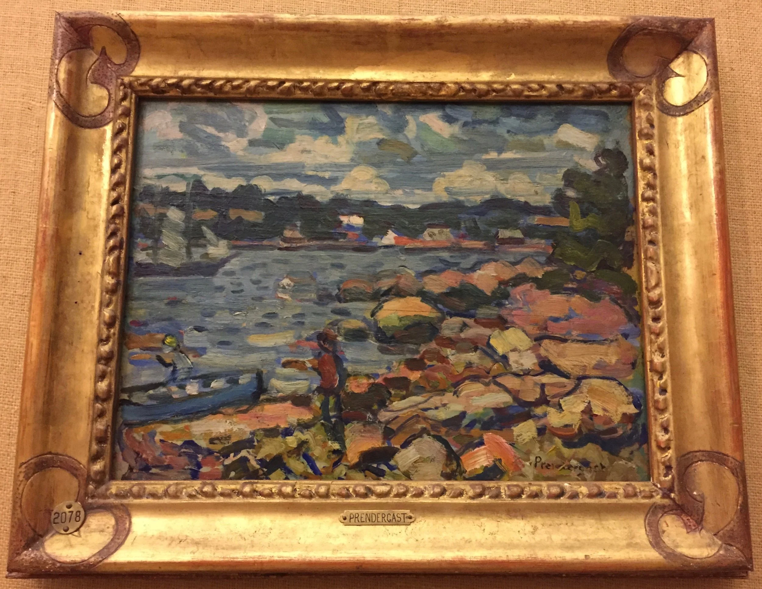
Maurice Prendergast in a Charles Prendergast frame with incised sausage motif at corners.

Maurice Prendergast in a Charles Prendergast frame with incised sausage motif at corners.

Detail showing another frame where the sausage motif is truncated due to cutting and rejoining.

Detail showing another frame where the sausage motif is truncated due to cutting and rejoining.

She explained: “…frequently Dr. Barnes would follow up the shipment…of the paintings he had purchased with a detailed list not only of where the paintings would be hung and where those that were thereby replaced should be rehung and so on, but also as a result of the new placements, which frames should now go on which paintings. It is not an exaggeration to say that an average of 50 moves might have to be made following the arrival of just one new painting. “ (Emphasis mine.)

Barnes’ attunement to the subtleties possible in a gilded surface are in evidence throughout his correspondence with artist-framemakers Charles Prendergast and Max Kuehne.

In a letter of April 15, 1915 he wrote to Prendergast regarding a shipment of 9 frames: “The color on two or three of them is rather glaring, of natural gold color, and need toning to slightly darker hue. I wonder if you would send a bottle of color to me by express with instructions how to apply it.” While adjusting the tone may have seemed a simple matter to Barnes any experienced gilder will surely counter this naïve viewpoint. In truth, the final toning of a gilded surface can be one of the most challenging and nuanced steps whether gilding new surfaces or matching one that is being restored. It is not surprising that Prendergast replied “I am afraid to have you touch those frames. You could spoil them very easy…”

While ordering frames from Max Kuehne,

Max Kuehne frame on work by Chaim Soutine

Max Kuehne frame on work by Chaim Soutine

Barnes frequently admonished him to emulate the frames of Charles Prendergast in both form and finish. Perhaps Barnes did not understand that carving is much like handwriting and the work of each artisan has its own distinctive qualities. On Feb 2, 1921 Barnes wrote to Kuehne,

“I think it would be one of the best possible things you could do, to have the Prendergast frame around, because the tones are unique and there are certain features in the carving that differ materially from yours- and it seems that these two points that make the appeal between his frames and yours. I see no reason why, after a break with your old habits in regard to carving and finishing, you should not make a frame at least as good as Prendergast.”

Nonetheless, Barnes did appreciate Kuehne’s work and wrote to say so on June 2, 1921. “I am sorry I didn’t enthuse over the Matisse design frame but I assure you it is about the best I ever had from you and I’ll probably want more made later if I get other pictures.”

In conclusion, the thought and care Dr. Barnes lavished on the framing and presentation of his art collection should come as no surprise. From the detailed correspondence with his art dealers regarding not just the artworks but also their frames, to the avid patronage of American artist-framemakers, to his deliberative, complex and ever-changing Ensembles, Alfred Barnes’ singular vision served to create a collection unparalleled then or since and offers us nearly endless avenues to a deeper understanding of both the art he collected and the subtle yet profound effects of a painting thoughtfully framed.

Framing Contemporary Watercolors

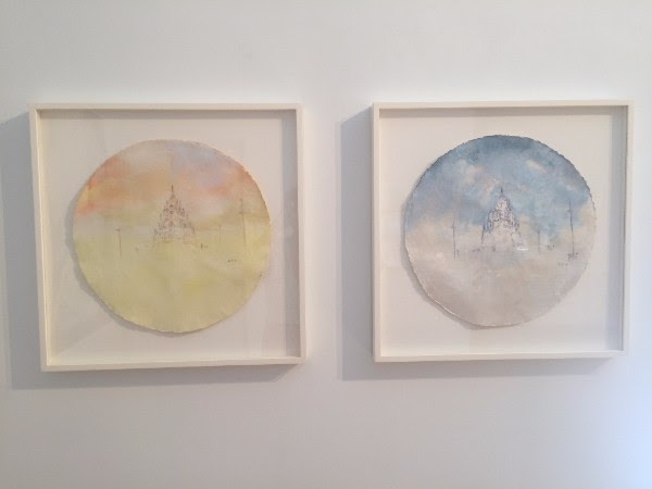
Contemporary framing can often become bland and uninteresting when the same plain style of frame is used for everything. I’m pleased to have worked with the artist Shelly Malkin in framing 29 of her luminous watercolors for her exhibition ‘Of Paradise, Storms, & Butterflies’.

Using a variety of treatments and finishes that honor and enhance each composition, we also floated the artwork without any over mat to emphasize the appealing edges of the paper.

Several of her paintings are in dramatic 40” X 60” and 27” X 83” formats; for these we selected a molding with a face of 1 to 1 ¾” width and sides that angle back toward the wall at a 45-degree, rather than the standard 90-degree, angle.

To amplify the effect of the large sheet size on the 40” X 60” artworks a special mount was used that raises the paper an additional 3/16” off the surface of the background.
This same style of float was used for a series of three ethereal tondo paintings to highlight their circular shape. 

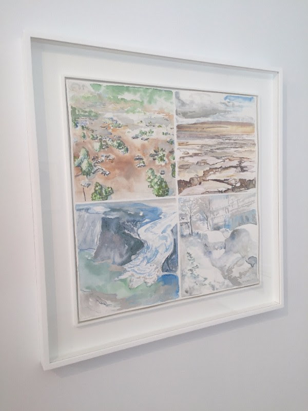
In a pair of paintings composed as a quadrant of four images we used a tray style of frame that implies a view through a window.  

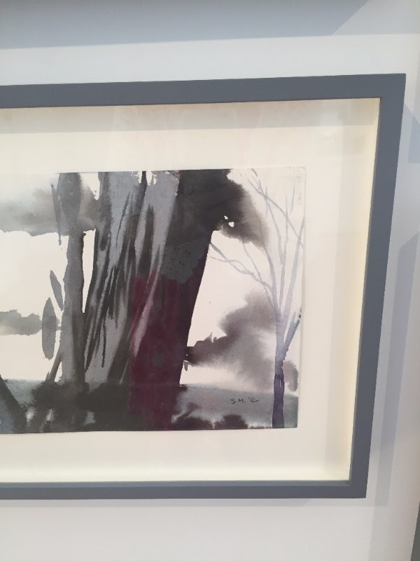
In the ‘After Sandy’ series a blue-gray finish underscores the harsh beauty of broken trees and devastated yet regenerative landscapes. 

Finally, all paintings were framed with UV-filtering acrylic that will protect the delicate nature of the medium.  Contemporary simplicity does not have to be without nuance and substance. I welcome your inquiries.

A Special Gallery Tour in the Metropolitan Museum of Art’s American Wing

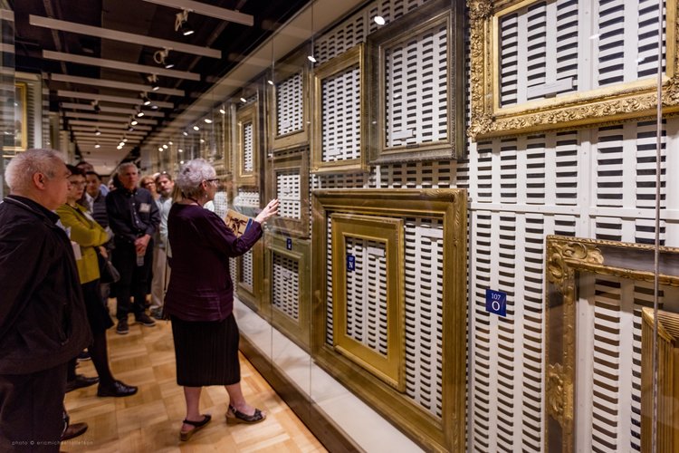
In the Luce study center.Photo by Eric Michael Tollefson.

In the Luce study center.
Photo by Eric Michael Tollefson.

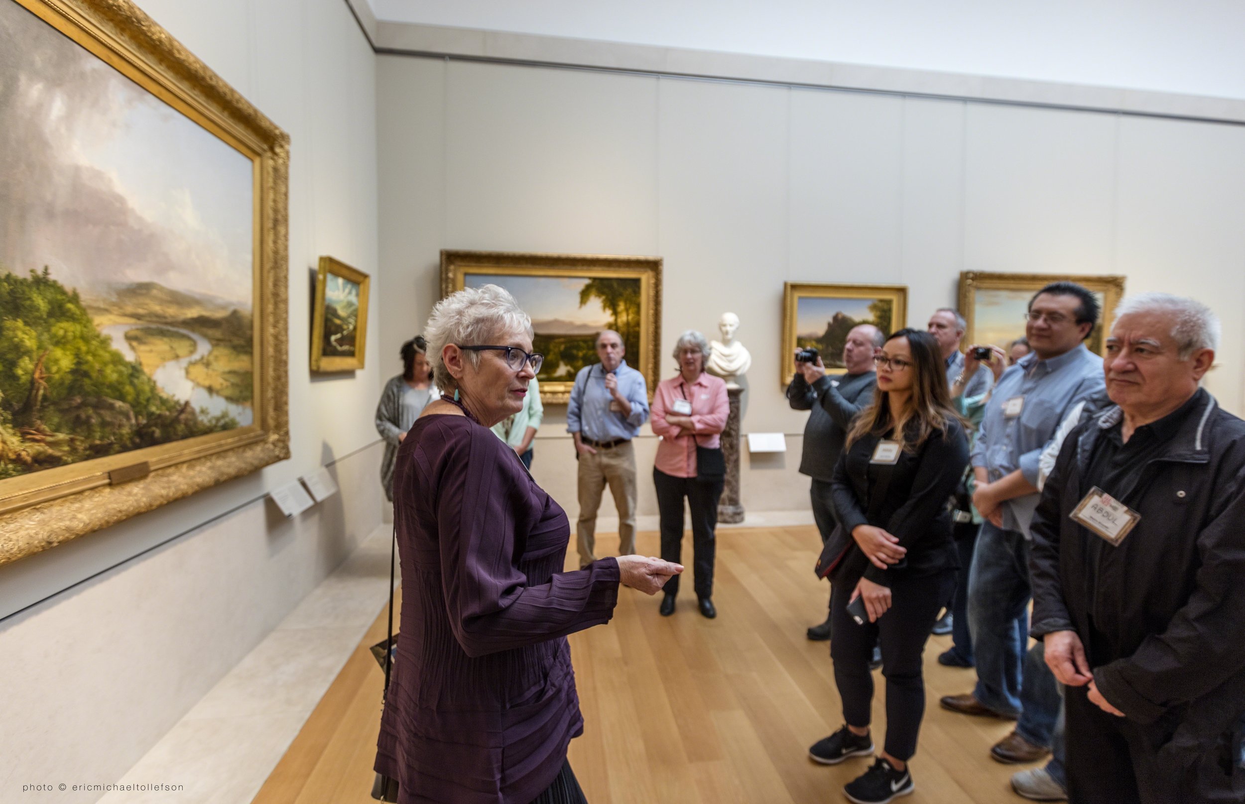
On Sunday, September 25, 2016 I was pleased to offer a frame-centric guided gallery talk about frames in the American Wing of the Metropolitan Museum of Art. The group who had requested the tour was the Metro-Atlantic Chapter of the Professional Picture Framers Association (PPFA).

The PPFA is a national organization of framers and frame shop owners; I had been delighted to have offered a keynote address at two of their annual conferences and to have also taught classes on several topics including the life and frame designs of noted architect Stanford White. The enthusiasm of PPFA members for American frame history makes them a wonderful audience, and the Sunday gallery talk was no exception.

We started the tour in the Henry R. Luce Center for the Study of American Art. (Galleries 773 & 774.) Many people do not realize that the study center visible storage contains an entire case of significant, untenanted American frames of the 19th and early 20th centuries. We started there and discussed things such as fabrication techniques and stylistic evolution of frame design between 1800-1930.

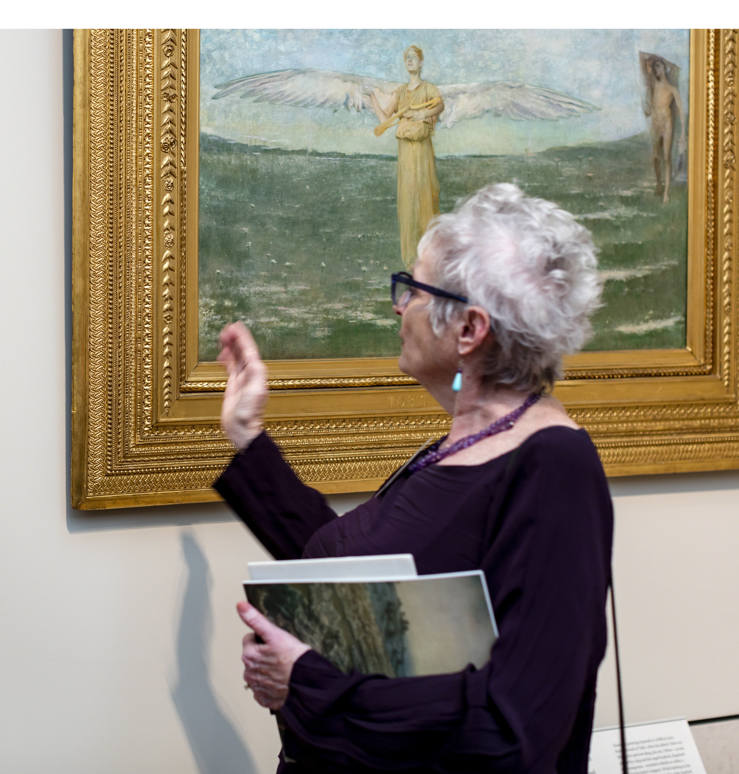
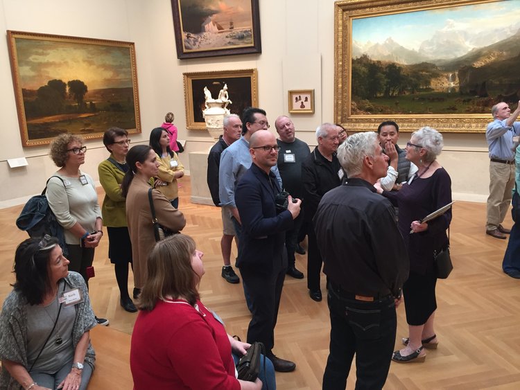
Next, we moved up to the paintings galleries and touched on a variety of different artworks: Thomas Cole’s View from Mount Holyoke, Northampton, Massachusetts, after a Thunderstorm—The Oxbow (1836), Eastman Johnson’s The Hatch Family (1870-71), artworks by Dwight Tryon and Thomas Wilmer Dewing in Stanford White frames and Madame X (Madame Pierre Gautreau) by John Singer Sargent (1883-4).

Discussing the frame on Thomas Cole’s View from Mount Holyoke, Northampton, Massachusetts, after a Thunderstorm- The Oxbow, 1836.Photo by Eric Michael Tollefson.

Discussing the frame on Thomas Cole’s View from Mount Holyoke, Northampton, Massachusetts, after a Thunderstorm- The Oxbow, 1836.
Photo by Eric Michael Tollefson.

Original Stanford White frame on Thomas Wilmer Dewing’s Tobit and the Angel, 1899.Photo by Eric Michael Tollefson.

Original Stanford White frame on Thomas Wilmer Dewing’s Tobit and the Angel, 1899.
Photo by Eric Michael Tollefson.

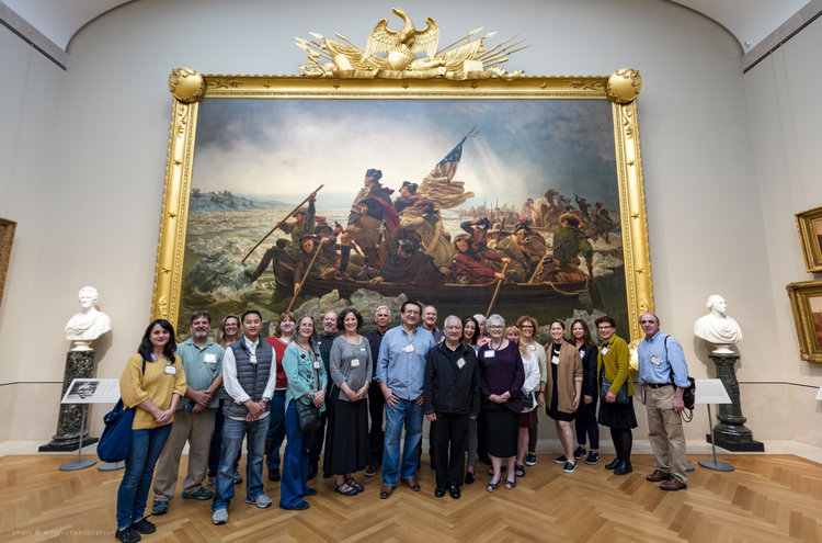
Our tour concluded in the Grand Salon (Gallery 760), which contains masterpieces such as Albert Bierstadt’s The Rocky Mountains, Lander's Peak (1863), Frederic Church’s Heart of the Andes (1859) and of course, Washington Crossing the Delaware by Emanuel Leutze (1851). The Leutze painting holds special interest for framers as the original frame, known only through two extant period photos. The frame was recreated for the painting by Eli Wilner & Company and went on view in 2012 following the expansion and reinstallation of the American Paintings galleries. There is an excellent bulletin from the MMA detailing all aspects of the project. The unique design, complex crest and monumental scale of the frame all make the grandly framed painting a dramatic and compelling sight. 

In the Grand Salon gallery, in the background Albert Bierstadt’s The Rocky Mountains, Lander’s Peak, 1863.Photo by 

 
Normal
0


false
false
false

EN-US
JA
X-NONE


<w:LatentStyles DefLockedState="false…

In the Grand Salon gallery, in the background Albert Bierstadt’s The Rocky Mountains, Lander’s Peak, 1863.
Photo by Susan Gittlen

The group in front of Leutze’s Washington Crossing the Delaware, 1851.Photo by Eric Michael Tollefson.

The group in front of Leutze’s Washington Crossing the Delaware, 1851.
Photo by Eric Michael Tollefson.

It was an enjoyable day where much was shared and we all took delight in celebrating the artistry inherent in picture framing.

Picturing Prestige at the Museum of the City of New York

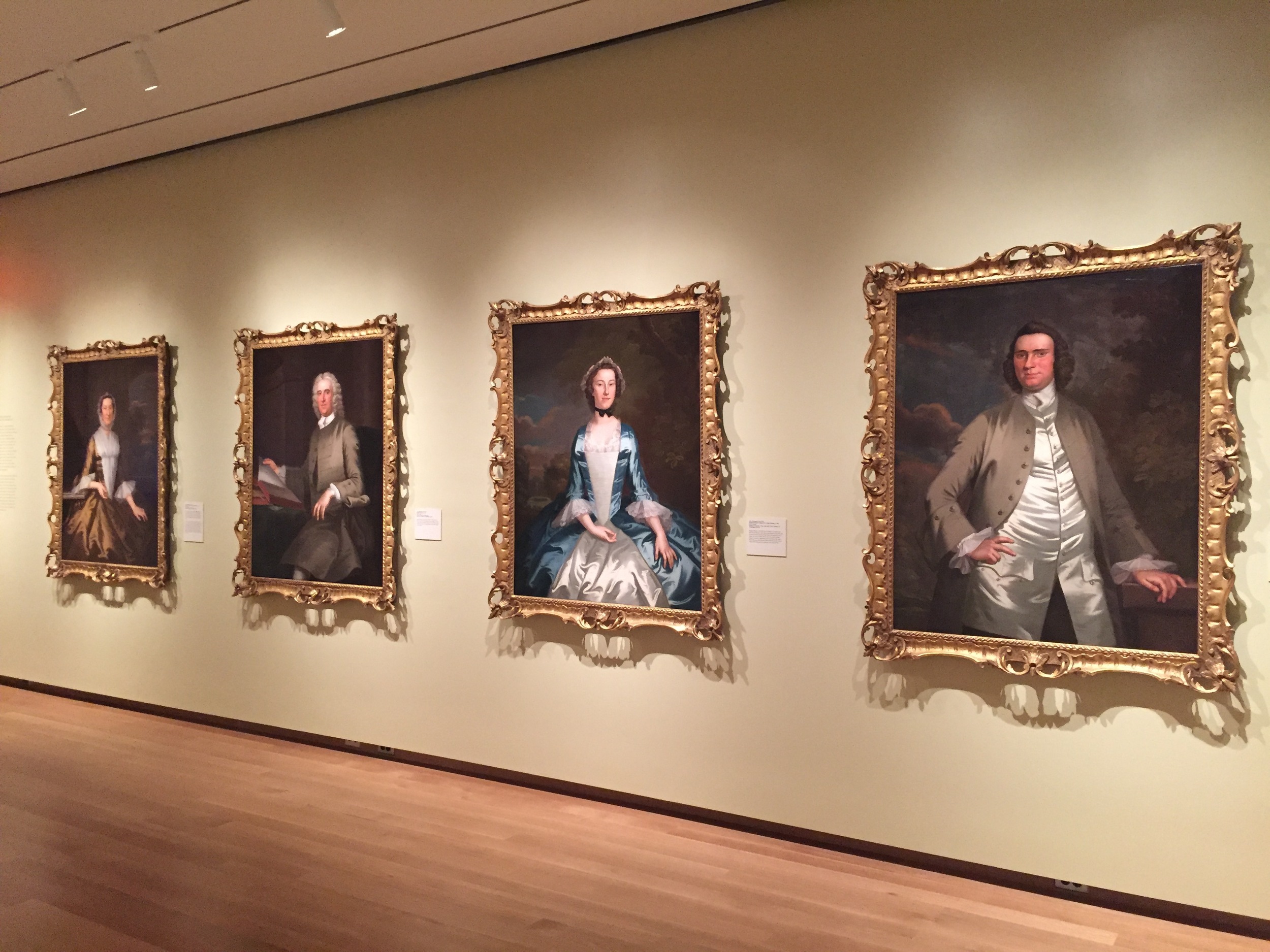
Two generations of the Marston-Phillipse family by English painter John Wollaston (1710-1775)

Two generations of the Marston-Phillipse family by English painter John Wollaston (1710-1775)

On view now at the Museum of the City of New York Picturing Prestige: New York Portraits, 1700-1860 draws from the permanent collection and showcases some of the finest examples of early New York City portraiture. Early, in this case, means the late 18th and early 19th centuries when New York became a thriving, populous center of the still-young United States.  Portraits were the most popular form of painting at the time, an important and prestigious chronicle of the wealthy and successful merchant class.

From a frame perspective the exhibition offers the opportunity to see some fine examples of late 18th Century carved and gilded frames as well as some fine examples of American frames typical of the 1840’s.  I recently walked through the exhibition with Dr. Bruce Weber, MCNY Curator of Painting and Sculpture and curator of the show; much of the information about the artists and sitters included here draws upon Bruce’s knowledge and research.

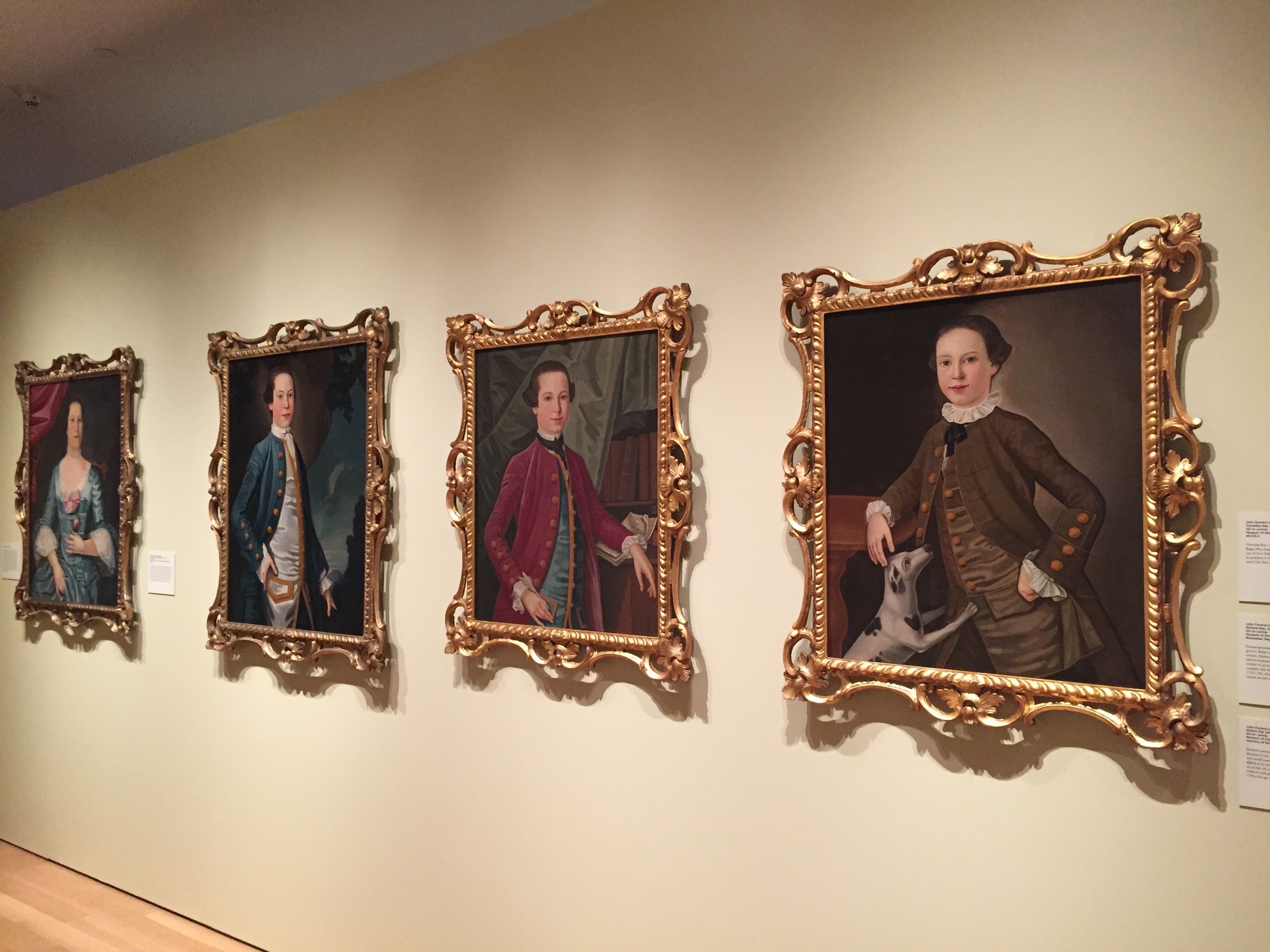
As you enter, there are two remarkable groups of late-18th Century portraits; at left is a group of four portraits depicting two generations of the Marston-Phillipse family by English painter John Wollaston (1710-1775). 

At right are four portraits of mother Sara Bogart Ray (Mrs. Richard Ray) and her three sons by John Durand (active 1766-1782). Little is known of Durand though historical material regarding the portraits indicates that the frames were made by Thomas Strachan, a British maker working in New York.

Sara Bogart Ray (Mrs. Richard Ray) and her three sons (Cornelius Ray, Richard Ray, Jr., and Robert Ray with dog) by John Durand (active 1766-1782).&nbsp;

Sara Bogart Ray (Mrs. Richard Ray) and her three sons (Cornelius Ray, Richard Ray, Jr., and Robert Ray with dog) by John Durand (active 1766-1782). 

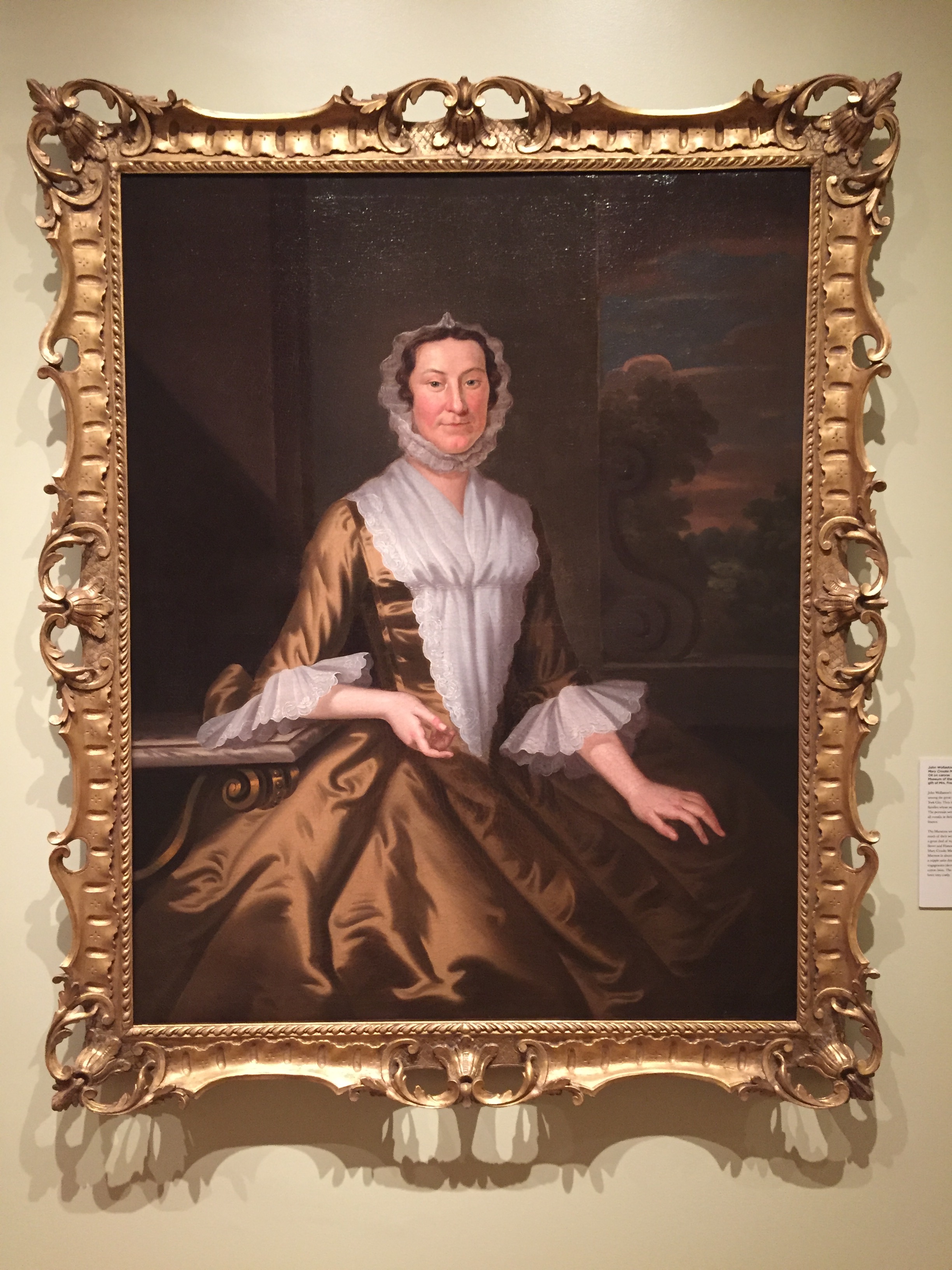
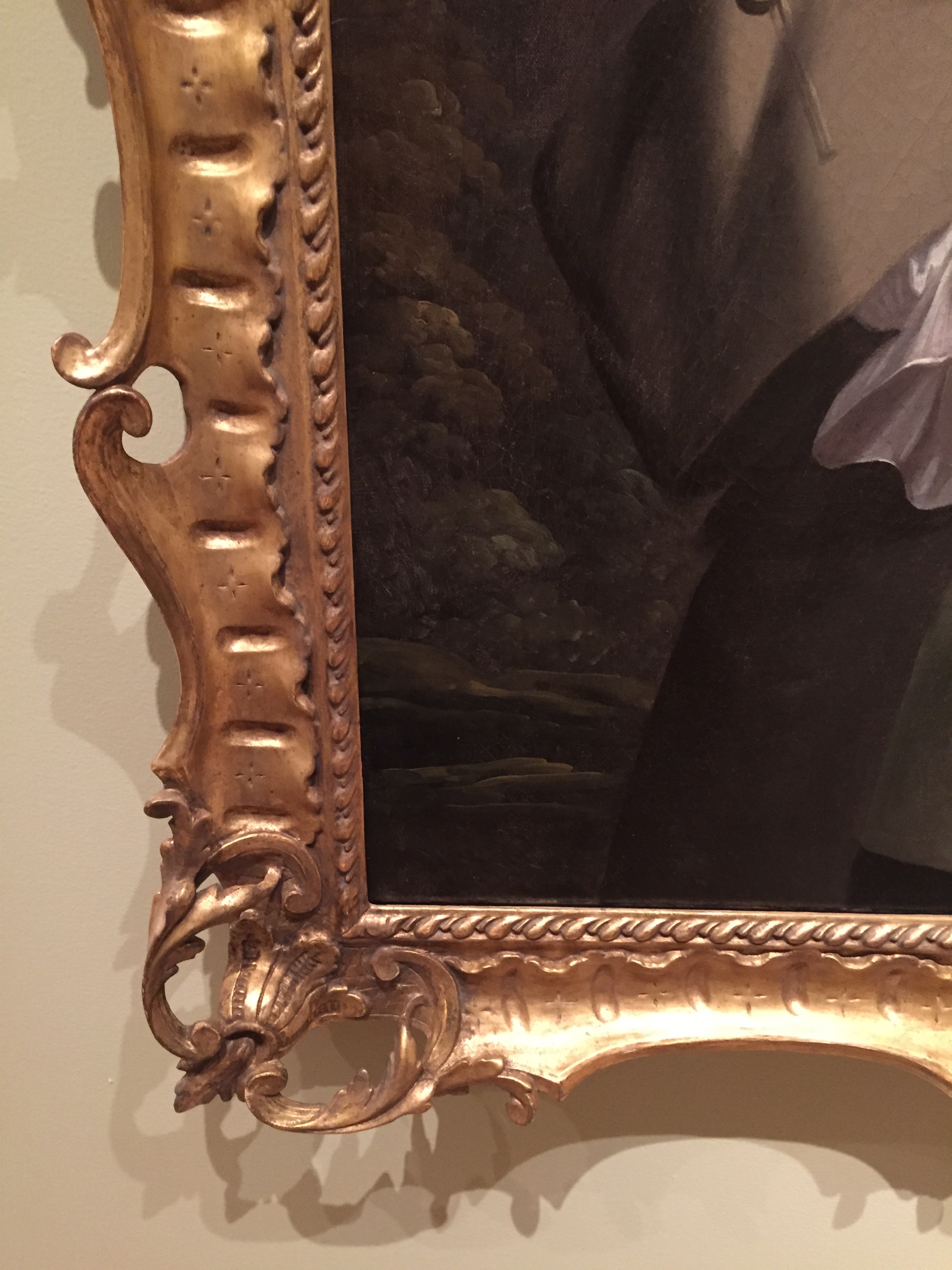
The frames on the Wollaston and Ray portraits are different in design though both are not only carved, but also typify the British Rococo style popular during this time. Both expressions are light and delicate in appearance and include C-scrolls, S-scrolls and gadrooning. The Wollaston frames have a leafy primary section with gadrooning as a small accent at the sight edge and pierced carving at the corners and centers.

Mary Crooke Marston (Mrs. Nathaniel Marston), c.1751 by John Wollaston (1710-1775)

Mary Crooke Marston (Mrs. Nathaniel Marston), c.1751 by John Wollaston (1710-1775)

Detail of one of the four frames on the portraits by John Wollaston

Detail of one of the four frames on the portraits by John Wollaston

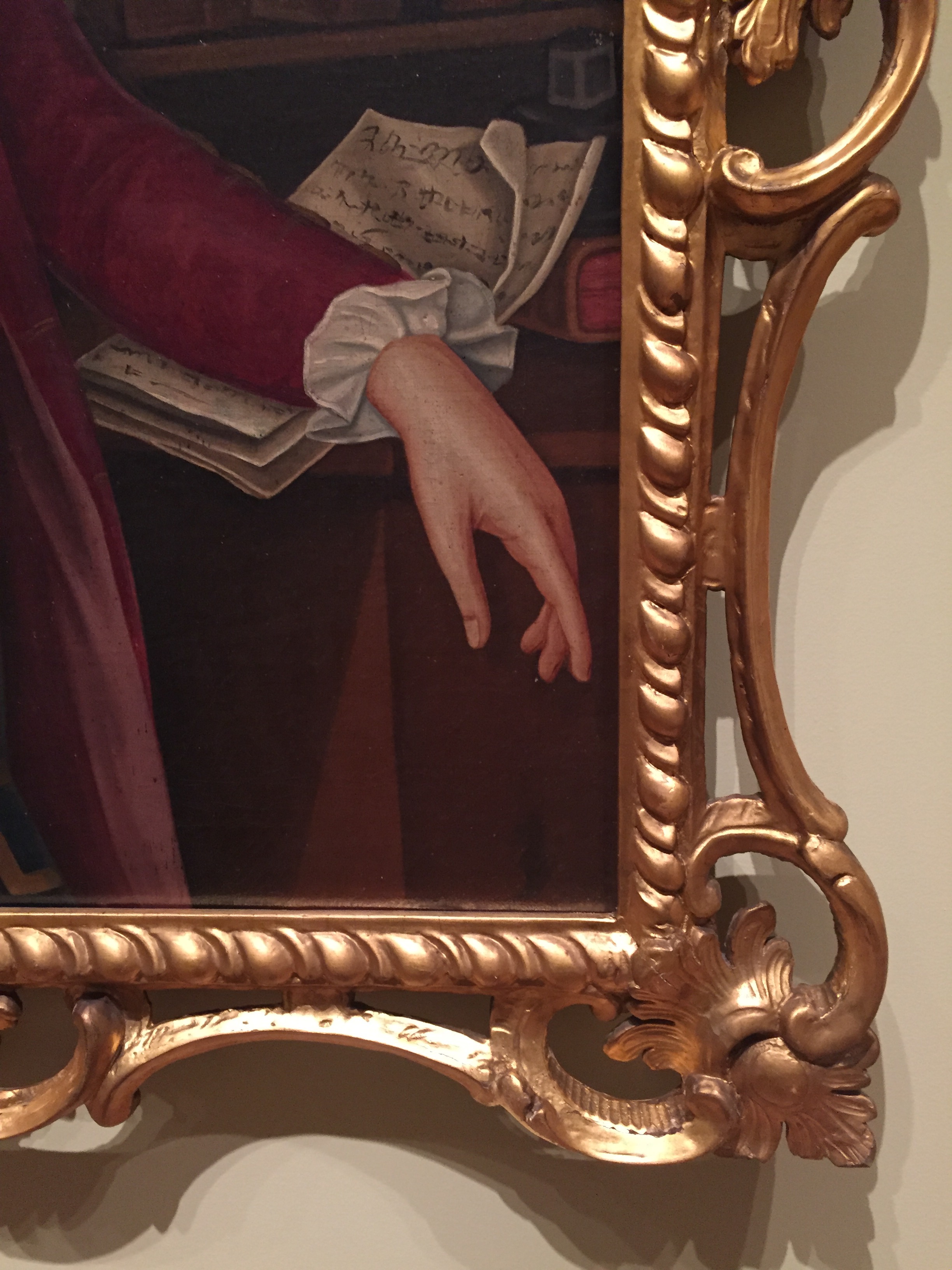
In contrast, the Ray frames eliminate the central panel entirely and use both the gadroon ornament as a bold anchoring motif at the sight edge

Richard Ray,Jr., c. 1766 by John Durand (Active 1766-1782), Detail

Richard Ray,Jr., c. 1766 by John Durand (Active 1766-1782), Detail

Detail showing gadroon sight-edge on Richard Ray, Jr. by John Durand

Detail showing gadroon sight-edge on Richard Ray, Jr. by John Durand

and exuberant yet delicate scrolls around the entire frame- with the exception of the corners and centers, which are accented by acanthus leaf flourishes.

Detail showing acanthus leaf flourishes and C-scrolls at centers on Richard Ray, Jr. by Durand

Detail showing acanthus leaf flourishes and C-scrolls at centers on Richard Ray, Jr. by Durand

It is remarkable that all these delicate frames have survived intact!

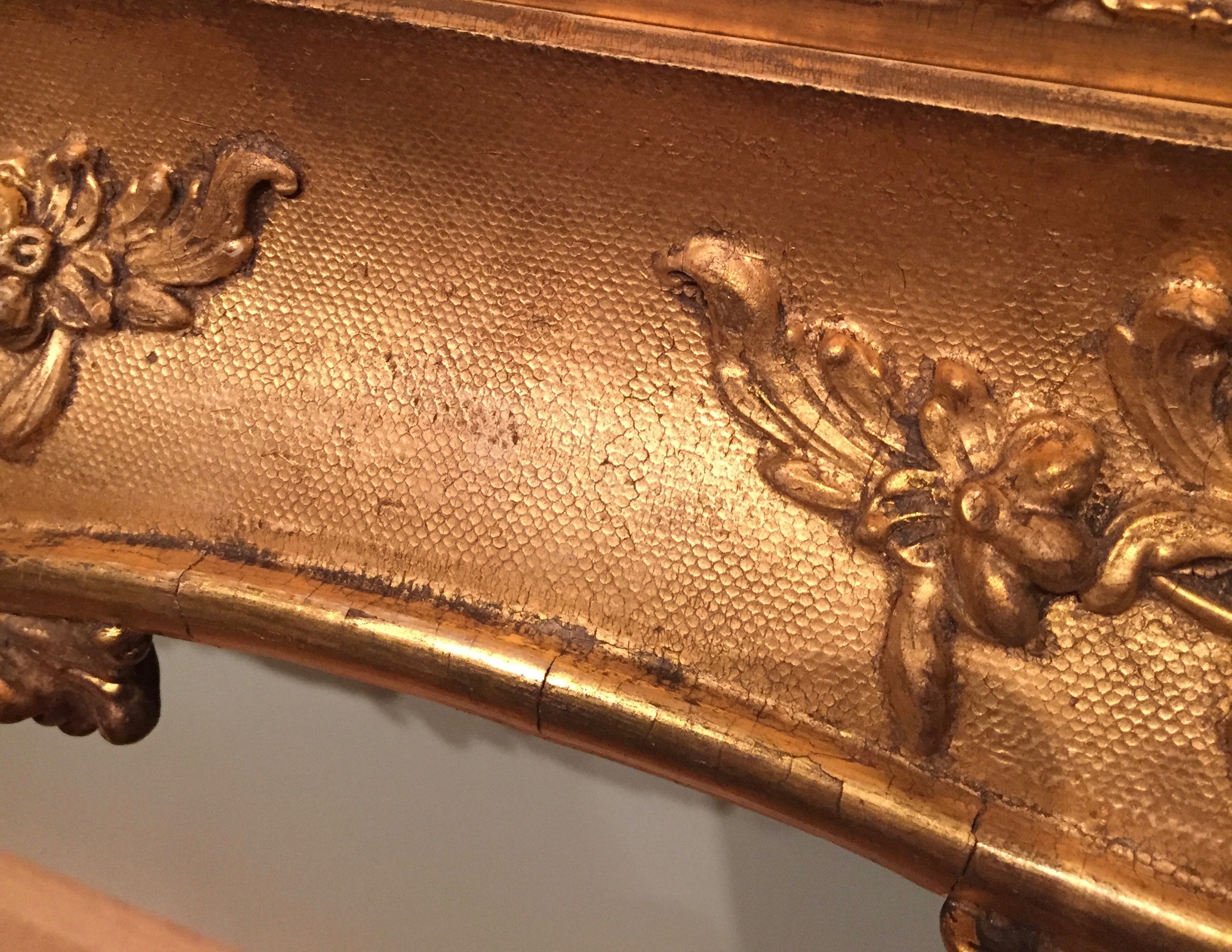
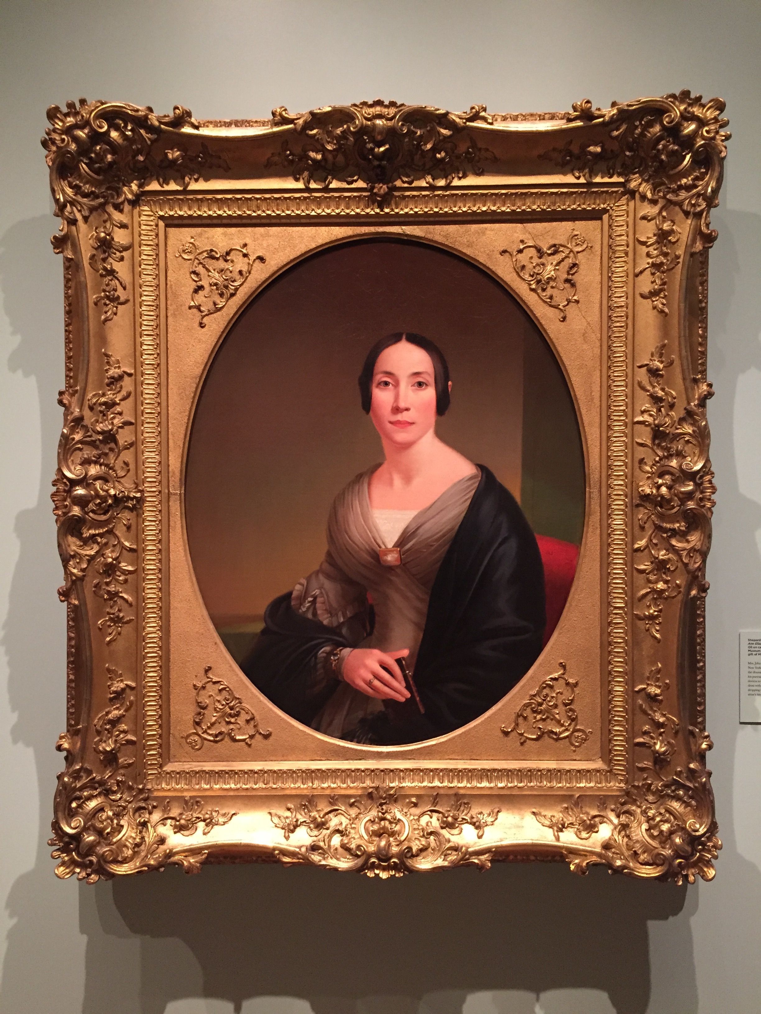
Also noteworthy in the show are a number of frames from the 1840’s. In America during that period it was popular to use a silk tulle on the frame as a ground for the applied ornament. The tulle gives the surface a delicate topography

Detail showing silk tulle ground on frame for Ann Eliza Moserman Brooks (Mrs. John E. Brooks), d.1845 by Shepard Alonzo Mount

Detail showing silk tulle ground on frame for Ann Eliza Moserman Brooks (Mrs. John E. Brooks), d.1845 by Shepard Alonzo Mount

not unlike that of the intricate surface recutting seen in earlier 18th Century French Louis frames.

Detail showing surface recutting on an 18th century French Louis XV carved frame.

Detail showing surface recutting on an 18th century French Louis XV carved frame.

Indeed, each of the frames on the portrait of Ann Eliza Moserman Brooks (Mrs. John E. Brooks), dated 1845 by Shepard Alonzo Mount (1804-1868) seen below

and the double portrait of Mr. and Mrs. Charles Henry Augustus Carter, circa 1848 by Nicholas Biddle Kittel (1822-1894)

Mr. and Mrs. Charles Henry Augustus Carter, circa 1848 by Nicholas Biddle Kittel (1822-1894)

Mr. and Mrs. Charles Henry Augustus Carter, circa 1848 by Nicholas Biddle Kittel (1822-1894)

Detail of frame on Mr. and Mrs. Charles Henry Augustus Carter, circa 1848 by Nicholas Biddle Kittel (1822-1894)

Detail of frame on Mr. and Mrs. Charles Henry Augustus Carter, circa 1848 by Nicholas Biddle Kittel (1822-1894)

both echo Louis XV frames with swept sides, projecting corners and centers and lush floral embellishments. Typical of the ornamentation of 19th Century frames, all these motifs were molded and applied not intricately carved as were their 17th and 18th-century French predecessors. 

Late 18th Century French Louis XV style carved frame

Late 18th Century French Louis XV style carved frame

These late 18th Century and 1840's frames are just highlights- there are a number of other excellent frames in the Museum of the City of New York exhibition- on view until September 18, 2016, it is well worth a visit.

Elisabeth Louise Vigée Le Brun: Part I: a review of the 2015-2016 exhibition, with a general note on some frames

Vigée Le Brun: Woman Artist in Revolutionary France, an exhibition: first shown at the Grand Palais, Paris, from Sept. 2015- January 2016; then at the Metropolitan Museum of Art, New York, until 15 May 2016; and continuing at the National Gallery of Canada, Ottawa, 10 June- 11 September 2016; reviewed here by Suzanne Smeaton, independent frame historian.

It is always a gift when a new exhibition includes notable frames, and the show of portraits by Elisabeth Louise Vigée Le Brun (1755-1842), currently on view at the Metropolitan Museum of Art, is certainly one of these. This exhibition, which was called a ‘ravishing, overdue survey’ by the art critic of the New York Times, is indeed beautiful, displaying a comprehensive collection of the artist’s intimate, insightful and skillfully-wrought portraits. They range from work produced at the end of the 18th century in France, to those she painted in Italy, Austria and Russia, having been forced to leave her country at the outbreak of the Revolution. Marie Antoinette was an early advocate for and patron of Vigée Le Brun, and her patronage provided access to many in the upper echelon of French society, and later in the courts of Europe.

Having recently seen the exhibition Louis Style: French Frames, 1610-1792 at the Getty, I was struck by the array of fine French frames, especially the many Louis XVI examples. I was also fortunate to walk through the exhibition with my friend and colleague Cynthia Moyer, Associate Conservator for frames in the Paintings Conservation Department at the Metropolitan Museum of Art. In addition the fact that she has worked on some of the frames in the show, Cynthia’s keen eye, and specific knowledge of gilding, French decorative art and frames, provided me with a deeper understanding of the nuances of many of the patterns there.

Jacques-François Le Sèvre, c.1774, private collection; Etienne Vigée, post 1773, Saint Louis Art Museum; Mme J-F Le Sèvre, c.1774-78, Private Collection

Near the entrance of the exhibition is a telling installation of three portraits showing Vigée Le Brun’s stepfather, brother, and mother, each framed in a different style, which together encapsulate contemporary taste.

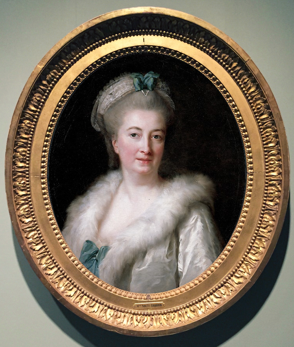
Louise Vigée Le Brun, Madame Jacques-François Le Sèvre, c.1774-78, 25 5/8 × 21 1/4ins (65 × 54 cm), Private Collection

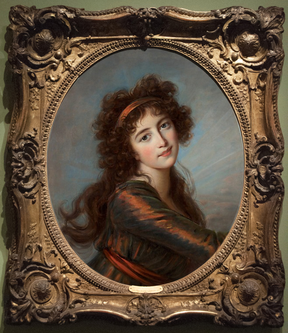
The oval portrait of the artist’s mother, Mme Le Sèvre (1774-78), is a quintessential late 18th century NeoClassical design, with a flat top edge, leafy acanthus in the cove, beads, frieze, and rais-de-coeur at the sight edge. The same moulding (albeit with slightly different proportions) frames the portrait of Madame Grand of 1783; this time surmounted by a complex and sinuous arrangement of ribbon (this is beautiful in its delicacy though most vulnerable: Cynthia Moyer stated that the carved ribbon had required strengthening and many small repairs.) Gene Karraker notes in his book, Looking at European Frames, that the oval format became popular during this time (especially for female sitters) because they were more economical to produce, requiring less carved ornamental moulding and no elaborate corners or centres.

Louise Vigée Le Brun, The artist’s brother, Louis-Jean-Baptiste-Etienne Vigée, post-1773, Saint Louis Art Museum

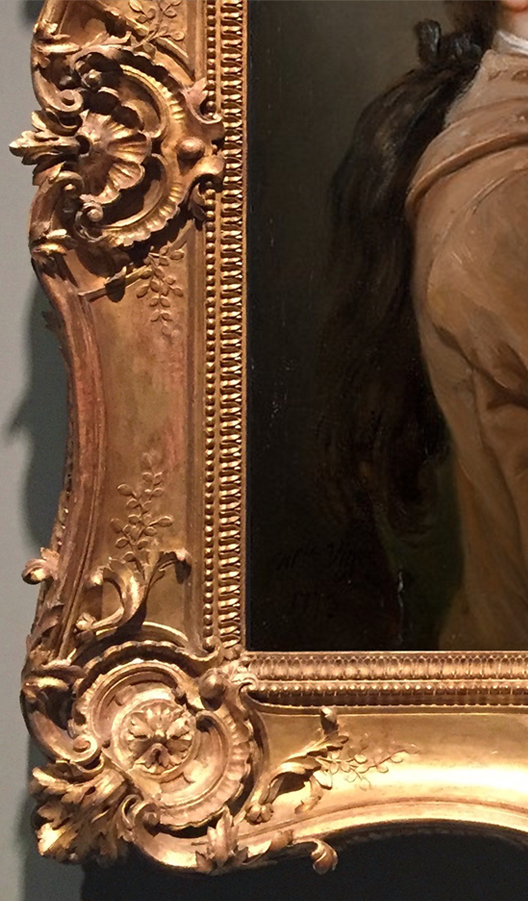
The middle portrait of the three, of Vigée Le Brun’s brother Etienne, 1773, is in a Louis XV-Louis XVI transitional design with swept rails and centre-&-corner ornament. The frame embodies ‘symmetrical Rococo’, where the graceful carving is rendered in carefully balanced forms – a departure from the asymmetric rocailles of earlier Louis XV frames, and a sign of the emerging taste for NeoClassicism.

Louise Vigée Le Brun, Etienne Vigée, corner detail

Cynthia called my attention to a small flourish of delicate, flat leaves on the frame; such a specific ornament might indicate a particular maker or atelier [see appendix below]. A similar motif is found on the frame for The Princess von und zu Liechtenstein as Iris, 1793, although the frame of Etienne has a rectangular sight, and that of the princess has an oval sight with spandrels; there are other differences in the various ornaments employed.

7elisabeth-vigecc81e-le-brun-j-f-le-secc80vre-c1774-priv-coll-sm.jpg

Louise Vigée Le Brun, Jacques Francois Le Sèvre, c.1774, Private collection; corner detail of frame

The portrait of J-F Le Sèvre, Vigée Le Brun’s stepfather, is in a popular Louis XVI design with an egg-&-dart motif beneath the top edge and a festoon of flowers emerging from a ribbon-bedecked central cartouche. This particular arrangement, with a central top element and swags down each side, is especially well represented in many variations throughout the show. Indeed, at least twenty of the seventy-nine paintings on view have these frames. The festoons or garlands (referred to dismissively as ‘cordes à puits’, or well ropes, by Charles-Nicolas Cochin) vary in their component parts: many are composed of husks (Princess Anna Alexandrovna Golitsyna, c. 1797, The Baltimore Museum of Art), some bay leaf-&-berry (Comtesse de la Châtre, 1789, Metropolitan Museum of Art) and others are lush combinations of many different flowers (Marie Antoinette With a Rose, 1783, collection of Linda and Stewart Resnick). There is an unusual example on Madame Etienne Vigée, 1785, private collection: rather than a rectangular or oval frame topped by a fronton or ribbons, the top rail arches up at the centre and becomes part of the large central rocaille ornament from which the festoons radiate.

8mme-dugazon-in-the-rocc82le-of-nina-1787-private-collection-sm.jpg

Louise Vigée Le Brun, Madame Dugazon in the rôle of ‘Nina’, 1787, 57 1/2 × 45 1/4in. (146 × 115 cm); frame: 78 3/4 × 60 5/8 in. (200 × 154 cm); Private collection

Another remarkable variant is on Madame Dugazon in the rôle of ‘Nina’; the swags of bound bay leaf-&-berry cascade down each side and appear to penetrate the frame from the front, emerging at the sides.

9vigee-le-brun-contesse-de-la-chacc82tre-met-mus-ny-photo-allan-harris-sm.jpg

Louise Vigée Le Brun, Comtesse de la Châtre, 1789, 45 x 34 1/2 in. (114.3 x 87.6 cm), Metropolitan Museum of Art. Photo: Allan Harris on Flickr

Nearby, the frame for the Comtesse de la Châtre is a fluted hollow frame with a top edge of centred guilloche, and a ribbon-bedecked scrolling clasp at the crest, from which the bunched bay leaf-&-berry emerges. This clasp is ornamented with piastres between acanthus leaves; the bay leaf festoon is caught at the corners on illusionistic nails, as in the case of most of these fronton frames. Cynthia noted that the frame is not original to the painting and has been cut to accommodate the Comtesse; it is an appropriate and very successful choice.

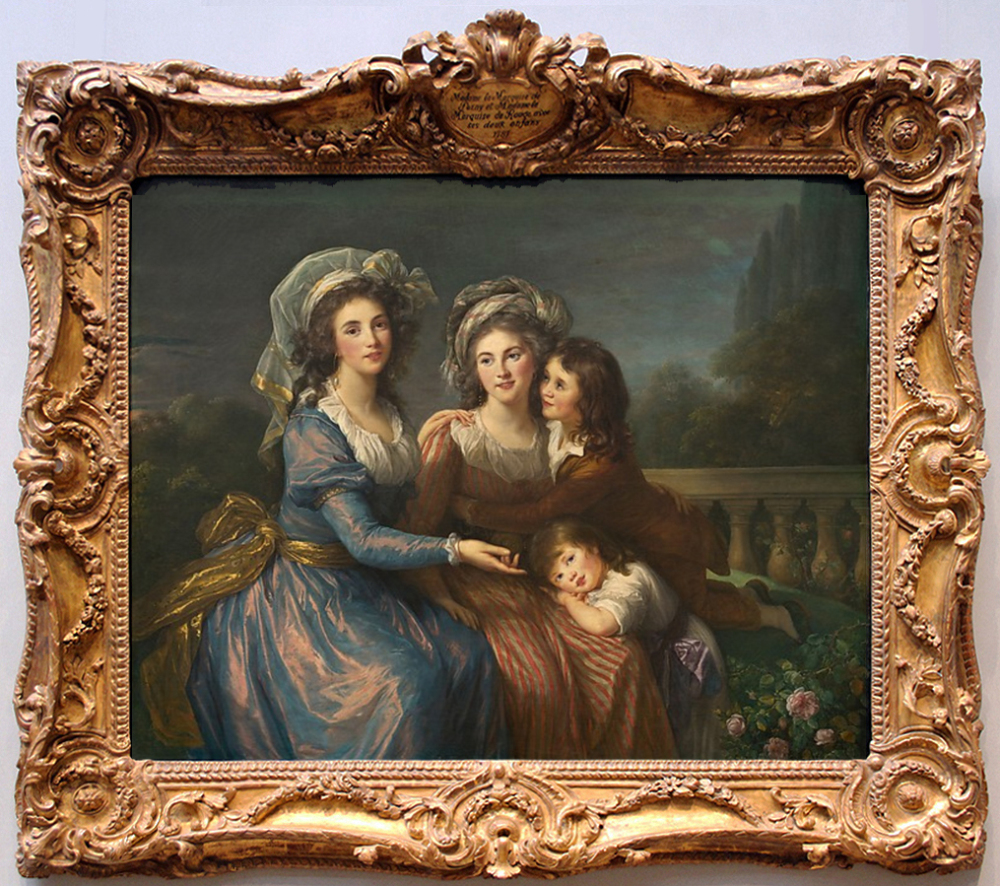
Louise Vigée Le Brun, The Marquise de Pezay, & the Marquise de Rougé with her sons, Alexis & Adrien, 1787, 489/16 x 613/8 ins (123.3 x 155.9 cm); frame: 70 x 80 x 7 1/2 in. (177.8 x 203.2 x 19.1 cm), National Gallery of Art, Washington. Photo: Marie Wise

Amongst other styles of frame on view is a magnificent tour-de-force of carving, on the large transitional Louis XV-Louis XVI frame for The Marquise de Pezay and the Marquise de Rougé with her two sons. Both front and back edges are swept, and the back edge has a guilloche moulding, both of which points are characteristic of transitional frames. The whole object is masterfully carved and extravagantly embellished. Garlands are swagged around the concave frieze of the frame, the garlands at the bottom defying gravity and arching upward.

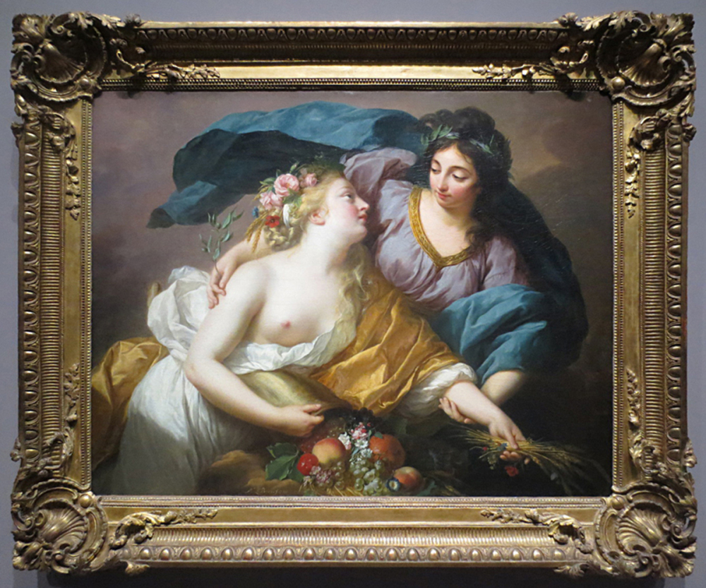
Louise Vigée Le Brun, Peace bringing back Abundance, 1780, Musée du Louvre

Other transitional Louis XV-XVI frames in the exhibition include those on Peace bringing back Abundance, and Giovanni Pasiello, 1791, Château de Versailles. Both frames are of the same design: a top edge of egg-&-dart, a fluted hollow and a flat frieze, anchored by a sumptuous rocaille ornament at each corner that extends across the fluting and over the frieze in leafy tendrils [see appendix].

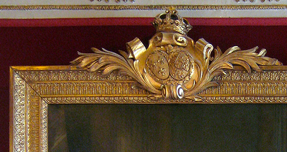
Louise Vigée Le Brun, Marie Antoinette & her children, 1787, Château de Versailles; corner detail of original frame with crest in situ at Versailles

NeoClassical designs are a striking counterpoint to the ebullient forms of Louis XV frames. While there are many loans from the collection of the Musée National des Chateaux de Versailles et de Trianon, there is a strict prohibition against photography of any of them. It is worth noting, however, that the large portrait of Marie Antoinette and Her Children (1787) from Versailles is exhibited in a rather modest frame. The original NeoClassical frame, quite grand and of significant size, was too large to fit within the constraints of the ceiling heights, so a temporary exhibition frame was made [see appendix below].

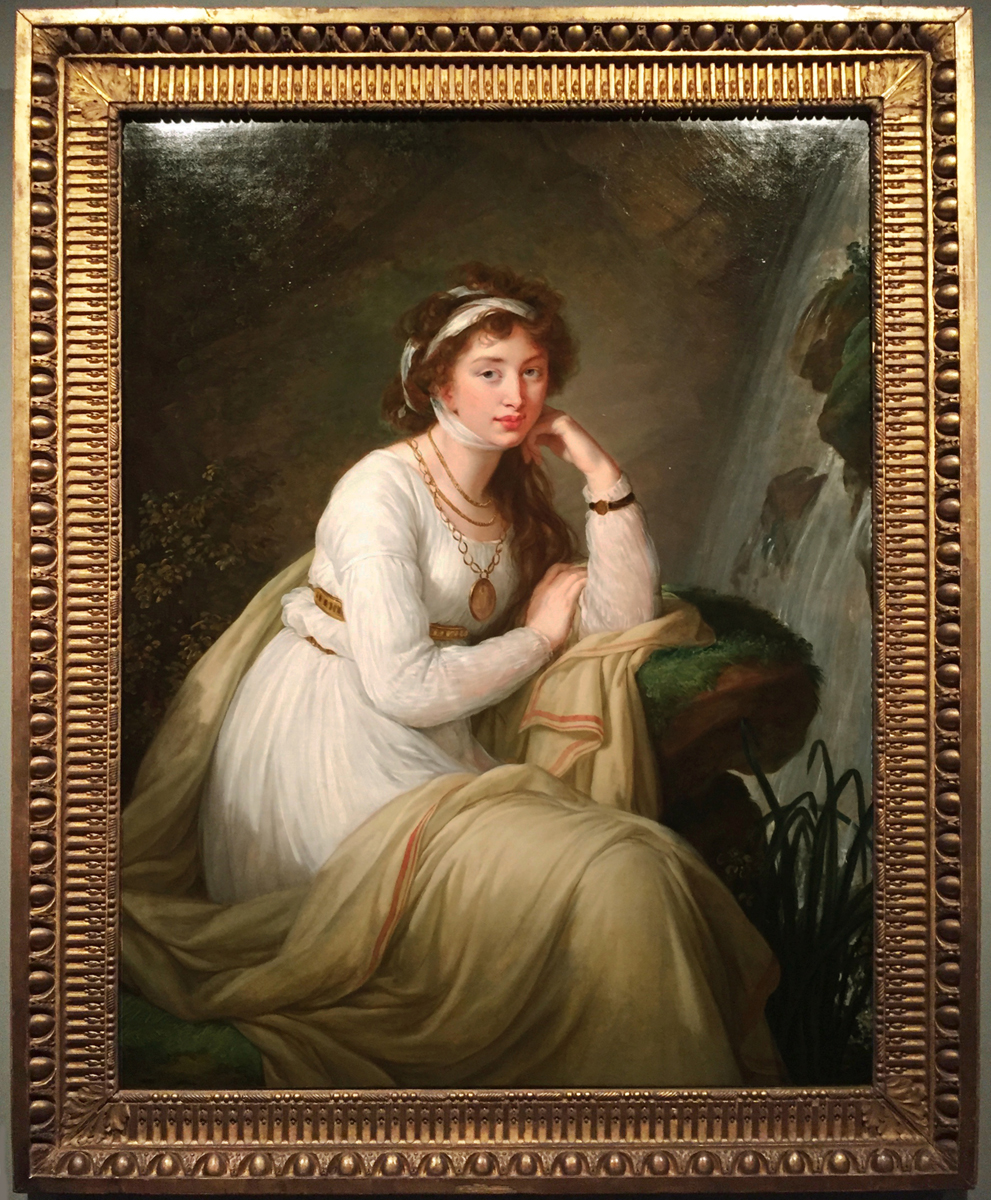
Louise Vigée Le Brun, Countess Anna Ivanovna Tolstaya, 1796, National Gallery of Canada, Ottawa

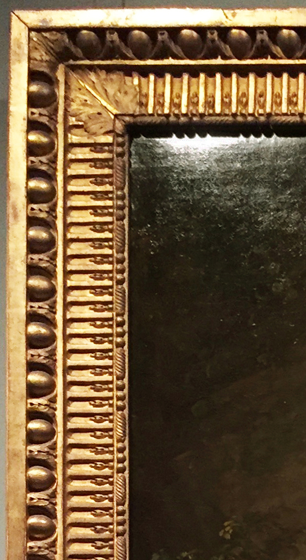
There is an especially pleasing fluted frame on Countess Anna Ivanova Tolstaya, 1796. When seen from a distance the overall restraint belies a sophisticated combination of classicizing ornament: a narrow unembellished top edge gives way to an assertive egg-&-dart embellished with leaf sprigs, a shallow fluted frieze with leaf buds in the channels, and a cabled astragal-&-triple bead at the sight edge. This may have been cut to fit the painting, as the sight edge does not conform to the arrangement of beads at the corners.

Louise Vigée Le Brun, Countess Anna Ivanova Tolstaya, corner detail

The show is a sumptuous offering of Louise Vigée Le Brun’s sensitive and sublime likenesses; that so many are displayed in historically appropriate frames of the late 18th century is a gratifying complement.


An appendix: some of Elisabeth Louise Vigée Le Brun’s frames (oil paintings)

9vigee-le-brun-contesse-de-la-chacc82tre-met-mus-ny-photo-allan-harris-sm.jpg

Louise Vigée Le Brun, Comtesse de la Châtre, 1789, 45 x 34 1/2 in. (114.3 x 87.6 cm), Metropolitan Museum of Art; reframed. Photo by Allan Harris on Flickr

Unfortunately we cannot depend upon the many strikingly beautiful frames on Elisabeth Louise Vigée Le Brun’s portraits being those in which they first entered their client collections; her continuing popularity as an artist has ensured that a particularly fine and ornamental class of frame has for a long period been considered indispensable to displaying her work (as with the Comtesse de la Châtre, above). However, as Bruno Pons points out relative to collections of art made in 18th century France, the frames would in the main have been fairly simple [1]. Likewise Blondel d’Azincourt, in his notes on arranging a collector’s cabinet, suggests only that the central works in a hanging may need an focal ornament at the crest of a frame, which implies that the supporting paintings had in general much less decorative settings:

‘Quelque fois même on fait ceintrer le haut de la bordure, ou l’on y met un ornement qui la couronne. Ce sera par exemple une guirlande qui surmonte le reste de la sculpture, ou si c’est un tableau qui représente un sujet, on y place les attributs qu’exige l’idée du peintre’ – Sometimes one may even highlight the crest of the frame by setting an ornament there which crowns it. There could, for example, be a garland carved at the top, or – if it is the frame of a subject painting – one might choose trophies which express the artist’s ideas [2].

Henri Danloux, The Baron de Besenval in his salon de compagnie, 1791, National Gallery, London

Both the drawings of the yearly Salon by Gabriel de Saint-Aubin (1724-80), and interiors such as Danloux’s portrait of Baron de Besenval confirm this state of affairs, so that the overpowering sense of carved riches in this exhibition of Vigée Le Brun’s work – although in many ways extremely just and attractive – may not reflect how the paintings were originally framed.

Louise Vigée Le Brun, The artist’s brother, Louis-Jean-Baptiste-Etienne Vigée, post-1773, Saint Louis Art Museum

Because of her association with the Queen, Vigée Le Brun had, like court painters of an earlier generation – Watteau, Lancret and Boucher – access to the carvers of the Bâtiments du roi, and her portraits of Marie Antoinette would certainly have been framed appropriately to the Queen’s status. This is less likely to be true of, for instance, the family portraits of her brother and errant stepfather, where very simple frames might be expected; yet the image of Etienne Vigée has ended up in what appears to be an example of the workshop of Jean Chérin, one of the more distinguished suppliers of the Menus-Plaisirs of the Royal Household.

Chérin stands out amongst his generation of carvers, as Paul Mitchell has established, being classed as a menuisier-sculpteur when he was admitted to the Académie de Saint-Luc in 1760, rather than as a simple menuisier or a menuisier-ébéniste.[3] His frames in transitional style, between the grand-luxe of Louis XV and the NeoClassicism of Louis XVI, are models of balance, hesitating between opulence and restraint. They are notable for several characteristics: the back edge is swept in S-scrolls like the top edge, and is decorated with a continuous intrelac moulding (not really visible in the image above); the corners and centres are symmetrical, but are set in delicate bands of rocailles; the sight edge is decorated with beading and rais-de-coeur; and the plain hollow frieze has the flourish of tiny leaves remarked by Suzanne Smeaton, above. These may be described as feuilles-à-tiges, after the example of the roses-à-tiges motif, and they appear (with the other characteristics noted) on other frames by Chérin.

checc81rin-frame-c1770-getty-museum.jpg

Jean Chérin (1733/34–85); transitional-style frame, c. 1770, carved, gessoed, & gilded oak; modern mirror glass, The J. Paul Getty Museum

One example is the Chérin frame in the collection of the Getty Museum, now on a looking-glass, which was shown in the exhibition of frames, Louis Style: French frames 1610-1792, at the museum from September 2015 to January 2016 . The motifs used – for instance in the corners and at the crest – are slightly different from those on the frame of Etienne Vigée; however, the latter is very close to the signed frame in the collection of Paul Mitchell, whilst the Getty frame is itself signed, indicating the variety of detail possible in an item which was in the mainstream of a certain style.

Louise Vigeée Le Brun, The princess von und zu Liechtenstein as Iris, 1793, Private collection

The oval portrait of Princess Caroline of Liechtenstein has a very similar frame to that of Etienne Vigée, but the quality seems less fine, and the spandrels which fill the corners around the oval are not properly integrated into the overall design. The inner fillet, for example, which in the latter picture borders the hollow frieze next to the sight mouldings, is awkwardly islanded in the frame of the princess, and sprouts secondary rinceaux of small leaves at top and bottom which conflict with the original sprays (now transformed to ivy leaves). This might be a workshop design, but seems more likely to be a copy, since it is hard to believe that a carver as accomplished as either Jean Chérin himself, or his son, Jean-Marie Chérin (fl. 1770s-post 1806), could be responsible for such an ungainly design.

Louise Vigée Le Brun, The Marquise de Pezay, & the Marquise de Rougé with her sons, Alexis & Adrien, 1787, National Gallery of Art, Washington. Photo: Marie Wise

The painting of the marquises de Pezay and de Rougé has a frame much more likely to be the real McCoy: the plastic nature of the carving, the complex interrelationship of rhythmic arcs around the contour, the variation of form in the corners and centres, and the triumphant flourish of the enlarged cartouche at the top, all indicating a better designer and carver than the craftsman of the last frame. This work was shown in the Paris Salon of 1787, and (presuming that this indeed is original, as the inscription may perhaps confirm) the solidity and undulating rhythm of the frame must easily have created a necessary space around the painting on the vast crush of the Salon walls. Unfortunately, a museum backing frame was added to this work some time ago, so it is not possible to check for a framemaker’s stamp, and none has been recorded for it. There are, of course, other candidates for its creation; see ‘Identifying the framemakers of 18th century Paris‘ by Edgar Harden.

peace-abundance-and-etienne-vigecc81e-corners1.jpg

Louise Vigée Le Brun, The artist’s brother, Louis-Jean-Baptiste-Etienne Vigée, post-1773, Saint Louis Art Museum, corner detail (top); Peace bringing back Abundance, 1780, Musée du Louvre; corner detail (bottom)

The frame of Peace bringing back Abundance in the Louvre is an example of the straight-sided version which developed from the transitional swept frame, as NeoClassicism took a firmer grip on the collective imagination. Otherwise, the corners display many of the elements seen in the frame of Etienne Vigée – the leaf terminal, rocailles, the little leafy rinceaux, and the double ornament at the sight edge – yet nothing is as crisply carved, or as confidently composed. The undercut scrolling leaves which spring from flowers at each side of the corner conflict with the fluted hollow, and the flat frieze beyond is too narrow comfortably to contain the rinceaux, which lose all their delicacy and élan.

Louise Vigée Le Brun, Marie Antoinette & her children, 1787, Château de Versailles; corner detail of original frame with crest in situ

The great fronton frame on the portrait of Marie Antoinette and her children, which was too large to travel with the painting from Versailles, has moved on into the purer NeoClassicism of the Louis XVI style.

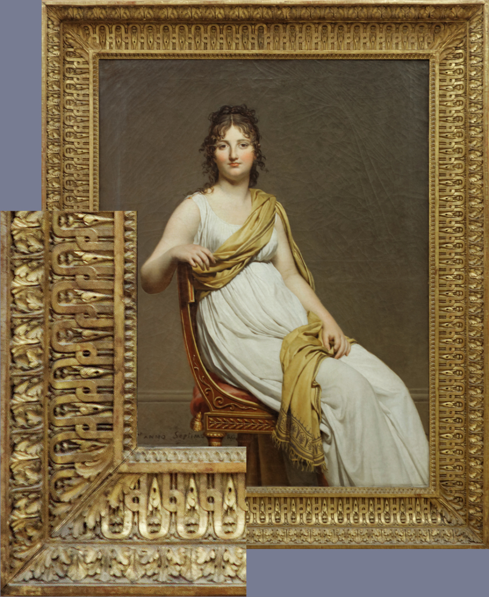
Jacques-Louis David, Mme de Verninac, 1798-99, Musée du Louvre. RF1942

It is very close to a design which can be seen more clearly on David’s Portrait of Mme Verninac – a further enrichment of the fluted concave NeoClassical moulding now framing the portrait of the Comtesse de la Châtre. The scotia or hollow fills most of the width of the rail, and is decorated with an intricate ribbon guilloche, the interstices of which are ornamented with leaves and flower buds. The ogee moulding above this is finely carved with cross-cut acanthus, and the sight edge with rais-de-coeur. The enlarged version of the pattern seen on Vigée Le Brun’s group portrait of Marie Antoinette and her children has a slightly richer sight edge, but is otherwise only aggrandized by the massive scrolled cartouche with the arms of France at the crest, supported by branches of palms and finished with a coronet. It is almost certainly the work of one of the major framemakers or sculpteurs from the Bâtiments du roi; it surrounds the portrait with a continual shimmer of light, as reflections ebb and flow across the fields of ornament – an echo of the animation the painter has bestowed on a family group which is both domestic and ceremonial.


[1] Bruno Pons, ‘Les cadres français du XVIIIe siècle et leurs ornements’, Revue de l’Art, no 76, 1987, p.41

[2] B.A. Blondel d’Azincourt, ‘La Première Idée de la curiosité, où l’on trouve l’arrangement, la composition d’un cabinet, les noms des meilleurs peintres flamands et leur genre de travail’, Institut d’Art et d’Archéologie, Université de Paris, IV, MS 34, fol.1-12, published as the Appendix to Colin Bailey, ‘Conventions of the 18th century cabinet de tableaux: Blondel d’Azincourt’s La Première Idée de la curiosité”, The Art Bulletin, vol.69, no 3, Sept., 1987, p.446

[3] Paul Mitchell, ‘A signed frame by Jean Chérin’, The International Journal of Museum Management & Curatorship, 1985, no 4, p147. A menuisier-sculpteur was the equivalent of a sculptor in wood, as opposed to the other gradations of framemaker, the menuisier or carpenter-carver, and the menuisier-ébéniste or cabinetmaker.

Posted on May 9, 2016 .
A Tale of Two Portraits

IMG_5331.jpg

At a recent Christie’s sale preview I saw two portraits that caught my eye due to their frames. It was gratifying to learn that both frames were original to the portraits.

The first, painted in 1844 by Jean-Auguste-Dominique Ingres (1780-1867) is a portrait entitled ‘Ferdinand-Philippe-Louis-Charles-Henri of Bourbon Orleans, Duke of Orleans’. The Duke looks out with an imperturbable, regal bearing from a most elaborate surround inspired by earlier Louis XV style frames with prominent corners and centers and a lavishly decorated inner spandrel.

 It’s interesting to note that Louis XV frames would have been completely hand carved, while this frame, as a 19th century object, utilizes molded and applied composition ornament.

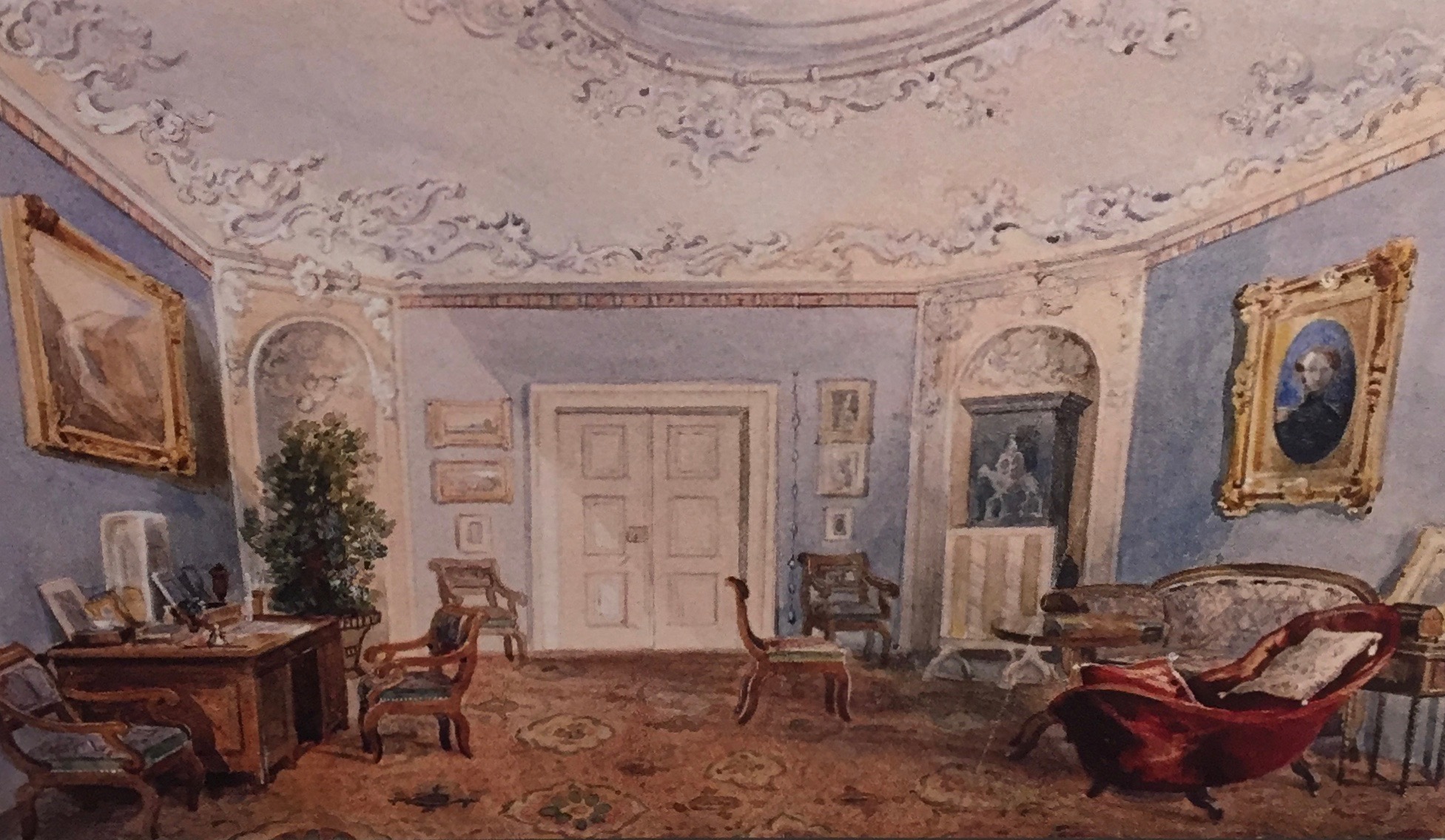
That the frame is original to the portrait is affirmed by a charming watercolor depicting the portrait of the Duke of Orleans in situ in the Grand Salon of Eisenach Castle, painted by the sitter’s younger brother Prince de Joinville in 1849.

Note the portrait in original frame on the wall at right.

Note the portrait in original frame on the wall at right.

The second portrait dates nearly 300 years earlier c.1541 and is by Renaissance painter and tapestry designer Jan Cornelisz Vermeyen (c.1500-c.1559).  The simple arch-top frame is painted black with simple, inner gilded moldings near the sight edge. The bottom of the frame with its canted horizontal rail is referred to as a wasserschlag or rain sill, a popular device in Northern European frames of the period that implies a window inviting the viewer inward.

The identity and position of the sitter is articulated in the script that occupies the central flat of the frame and tells us that it is Joost Aemszoon van der Burch, legal counsel to the Holy Roman Emperor, Charles V at the Council of Brabant.

The elegantly austere surround on the stoic, commanding presence of van der Burch couldn’t be more different from the florid extravagance of the Duke of Orleans and his dispassionate gaze and I am captivated by them both. Both men meet us in perfect attire, each emblematic of his own place and time.

Credit due to the Christie’s cataloging staff for suppling such excellent background on both artworks.


French Louis Frames at The Getty Center

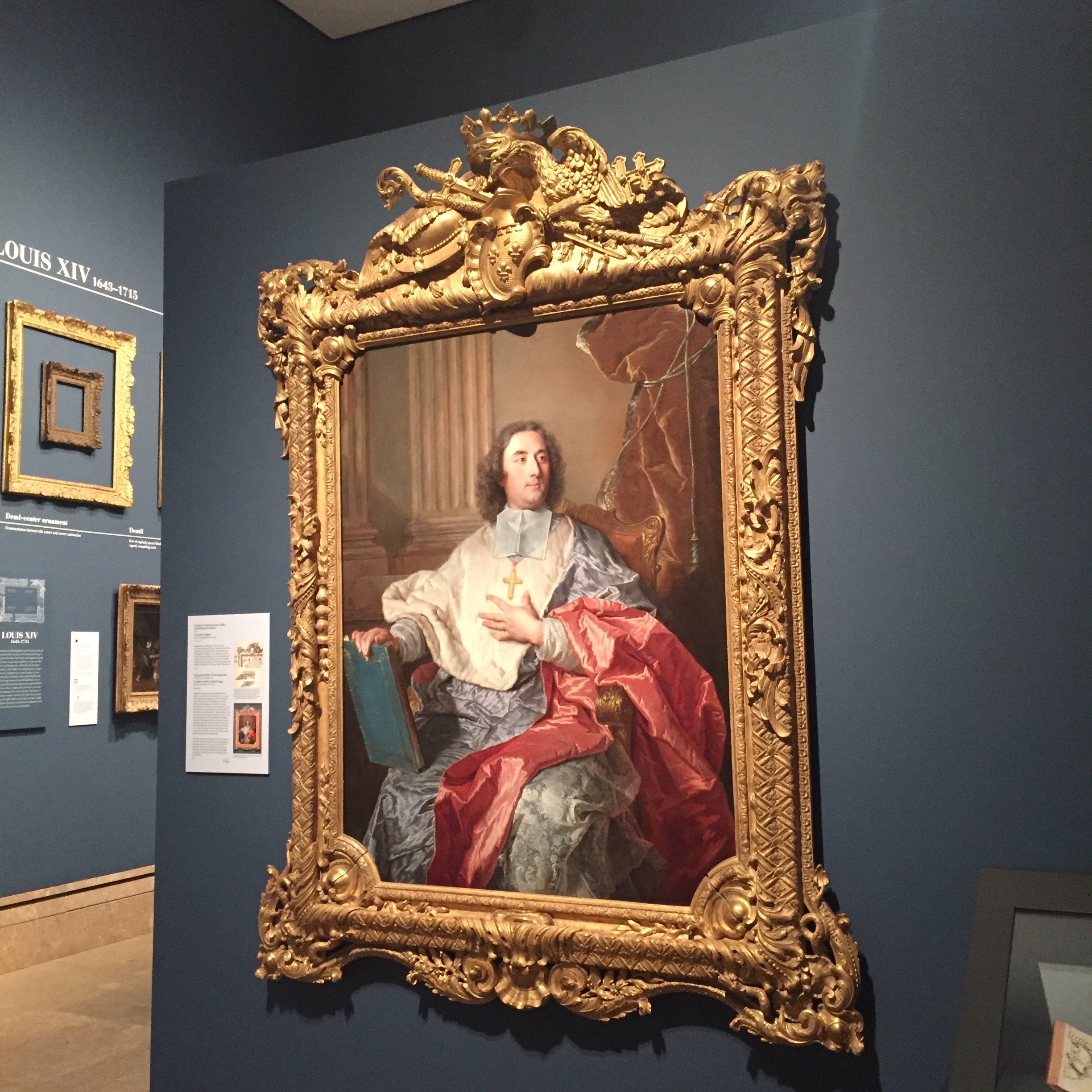
Carved and gilded French Trophy Frame designed by Gilles-Marie Oppenard

A trip in early December 2015 to The Getty Center in Los Angeles provided an opportunity to see some of the finest examples of 17th and 18th Century French frames. I’d reached out to colleague and Getty frame conservator Gene Karraker to make a visit and he was a gracious host. It’s a terrific show and I am thrilled to have been able to see it. I was unexpectedly delighted to see my friend and colleague Lynn Roberts of The Frame Blog (London) there to join us, a special surprise arranged by friends and frame colleagues Rob and Barbara Markoff of San Diego.

The exhibition "Louis Style French Frames 1610-1792” (September 15, 2015- January 3, 2016) surveyed frame design in France when frame design, carving and gilding were at their zenith.  While I am offering here my own cursory impressions and observations of the show, the Getty website has a feature on the exhibition that provides a valuable download-able pdf of all label text with in-depth information on each era and individual frame . Further excellent reading can be found in the 2009 book ‘Looking at European Frames: A Guide to Terms, Styles, and Techniques’ by D. Gene Karraker.

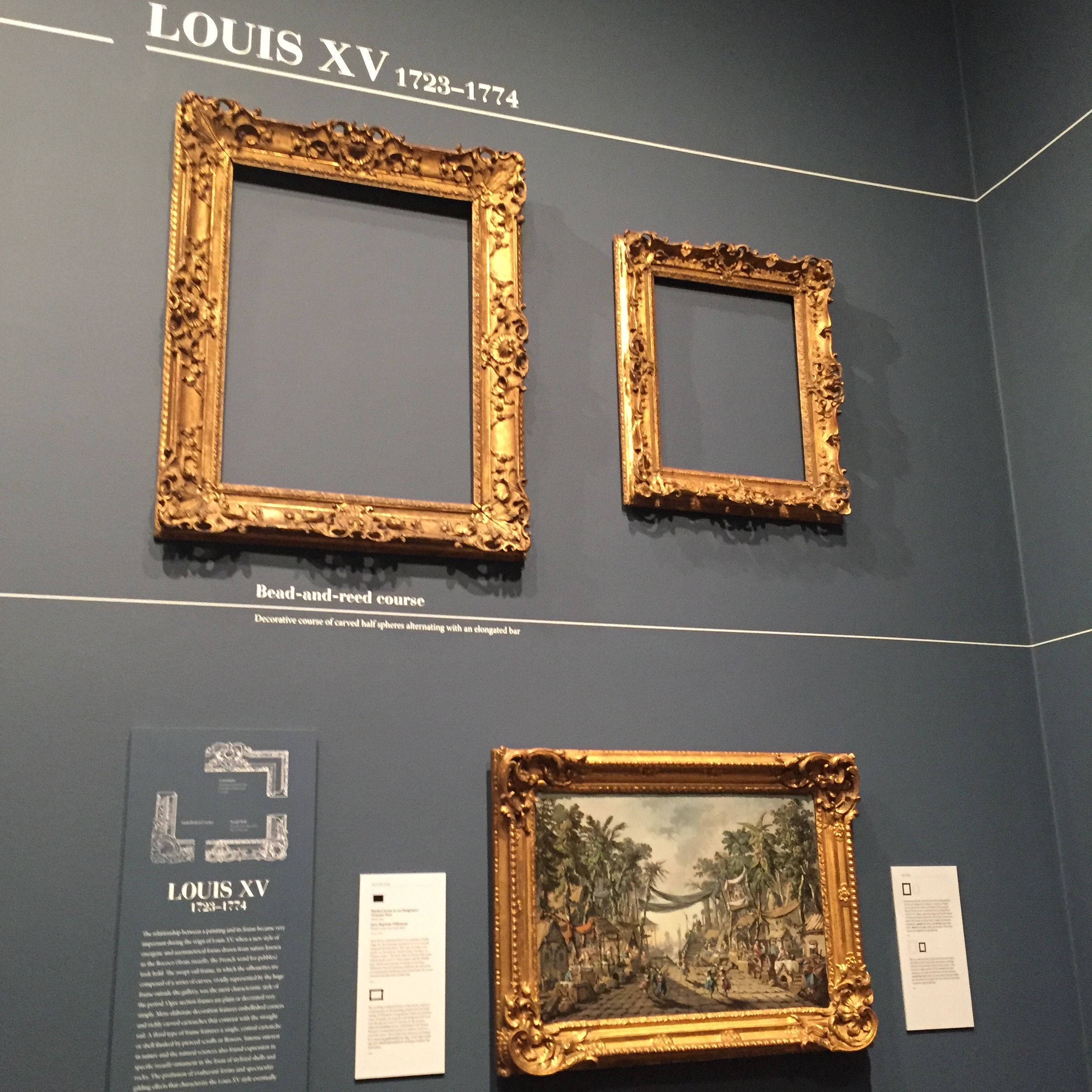
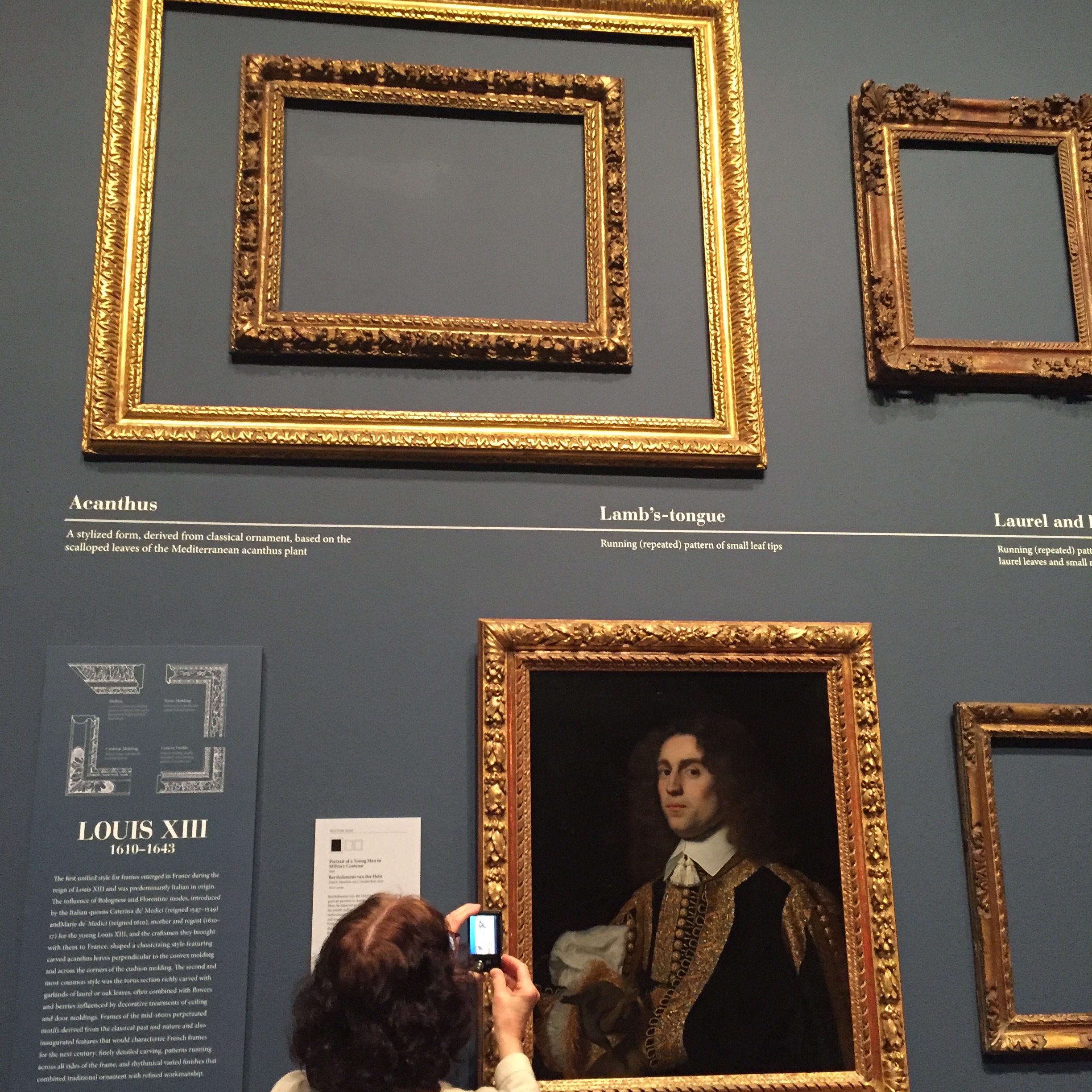
The exhibition is in one high-ceilinged room with both an upper and lower row of frames and I especially appreciated being able to see the range of stylistic evolution from LOUIS XIII to LOUIS XVI frames. It is fascinating to see the use of profiles, forms and ornament as they reflected changing taste in decoration and style. Beautifully patterned Louis XIII frames reflect the Italian influence of the Italian queens Caterina de Medici (reigned 1547-1549) and Marie de Medici (reigned 1610 and mother and regent for the young Louis XIII) and the craftsmen they brought with them. 


Louis XIII frames reflect the influence of Italian design and craftsmanship.


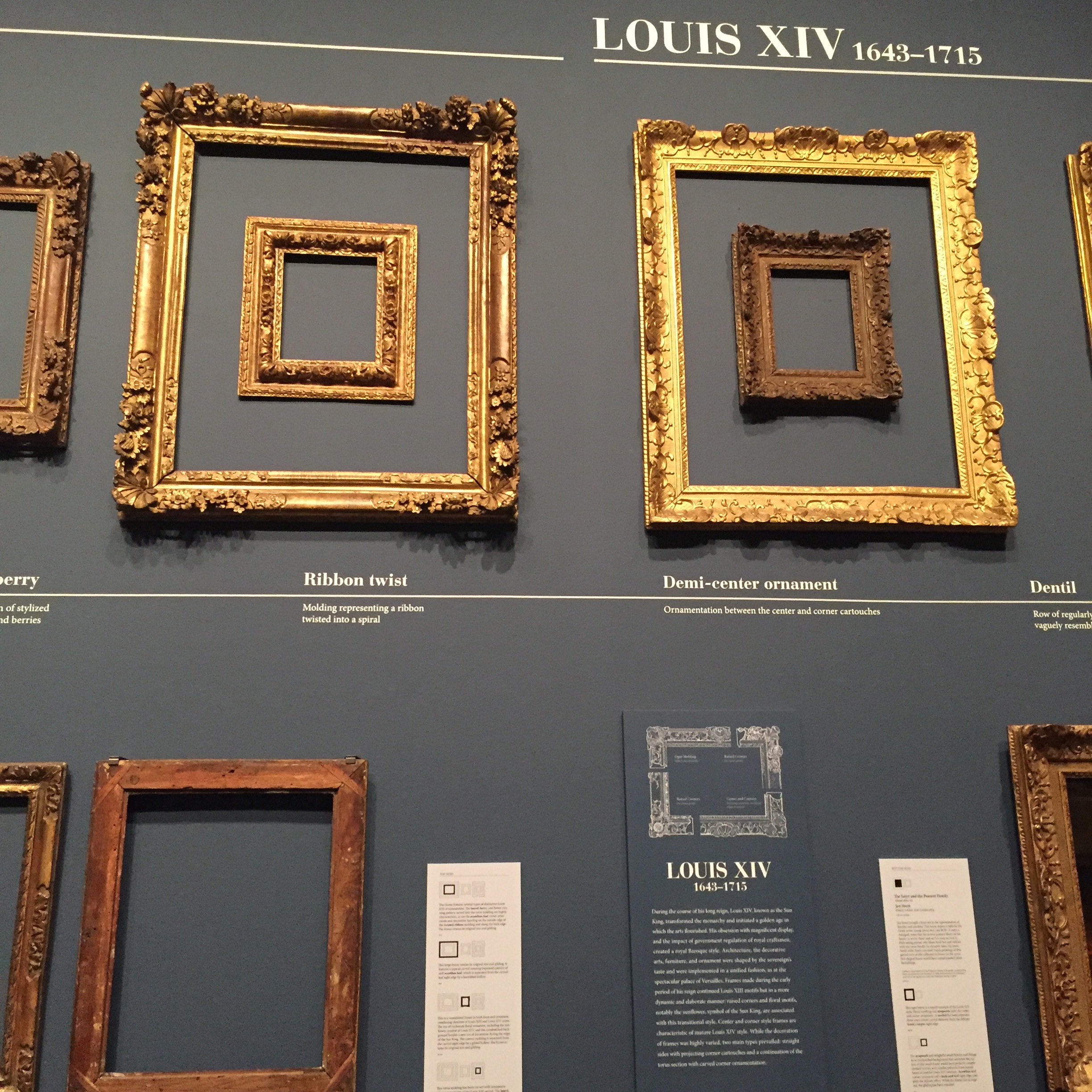
Increasingly ornate frames during the Louis XIV period even occasionally incorporated the sunflower motif- the symbol of the ‘Sun King’.


Note the sunflower motif on the corners of the frame at upper left.


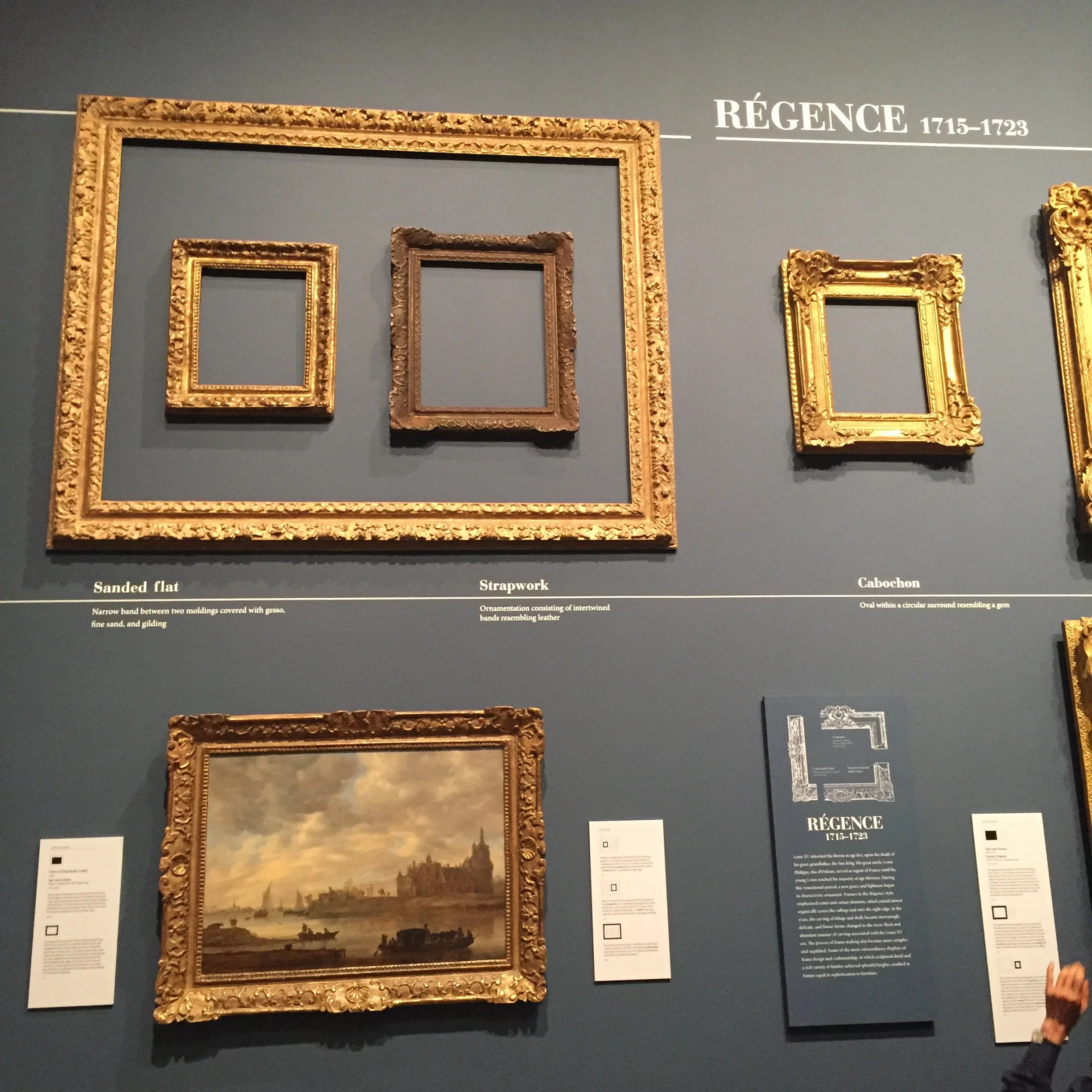
During the transitional Regence period (1715-1723) ‘center and corner’ frames became increasingly popular and lavish surface decoration with nuanced surfaces prevailed.


Center-and-corner frames became increasingly popular during the Regence period.


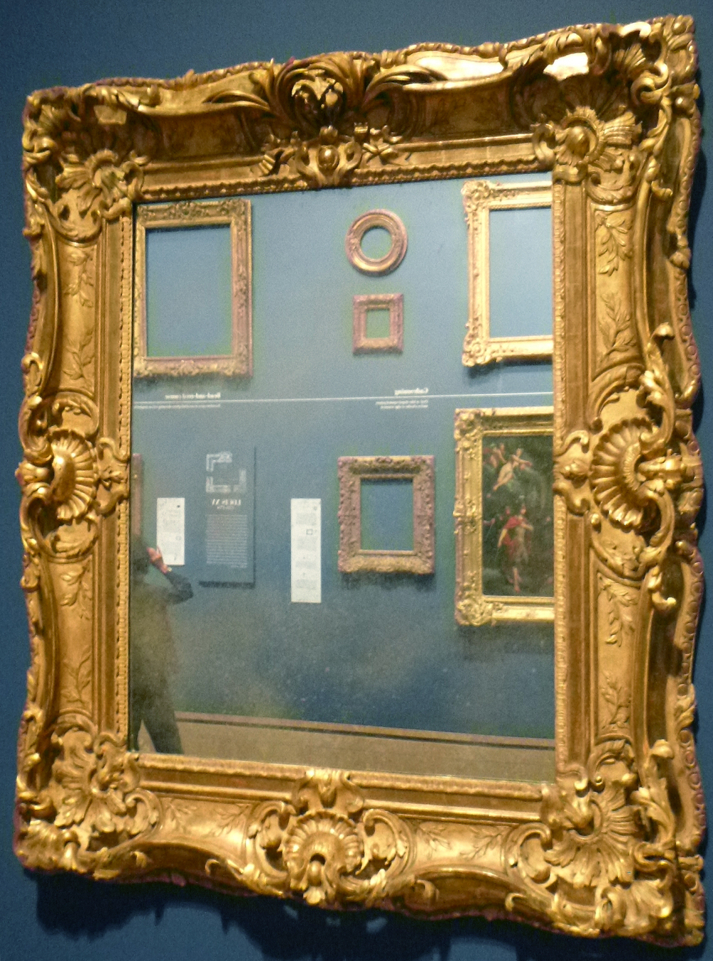
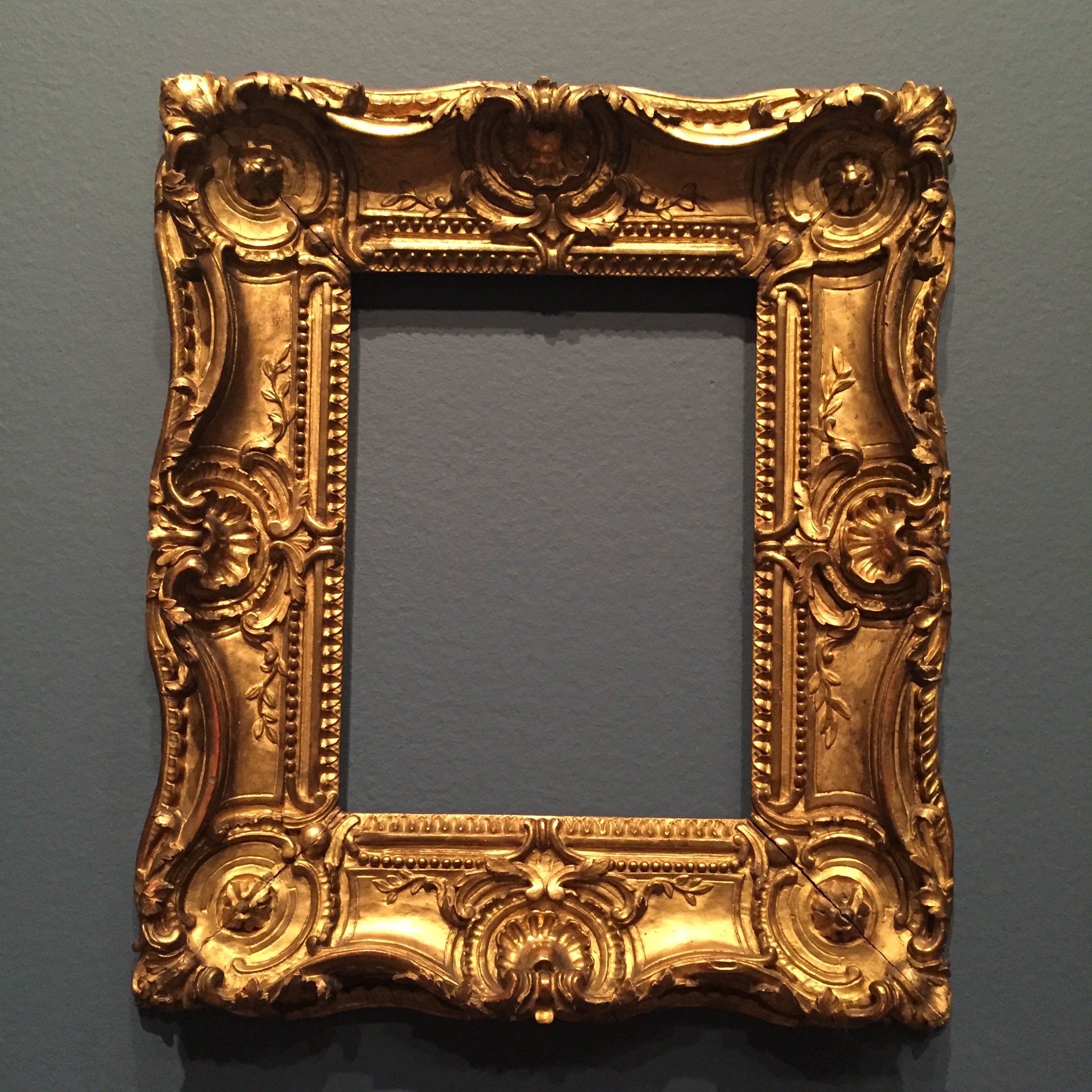
The most ebullient designs are embodied in the Louis XV style frame when exuberant Rococo ornament, swept sides and pierced carving were utilized to create frames of astonishing beauty and complexity. 

Swept sides and pierced carving are typical of Louis XV frames.

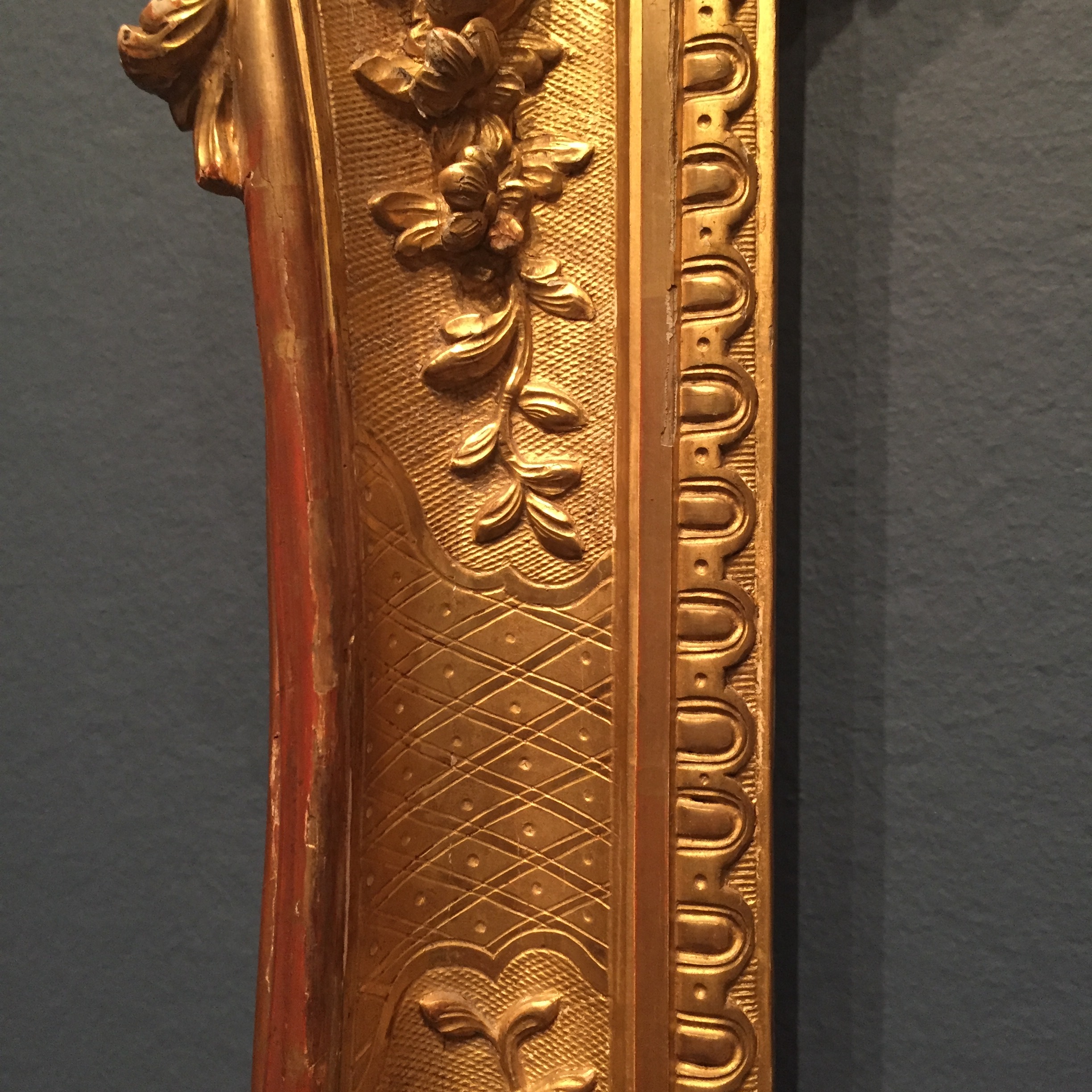
Note the reparure ('recutting') in the surface.

Note the reparure ('recutting') in the surface.

The surfaces are further embellished with recutting (reparure) a method of incising additional detail into the frame surface. The decoration is as delicate as fine jewelry.
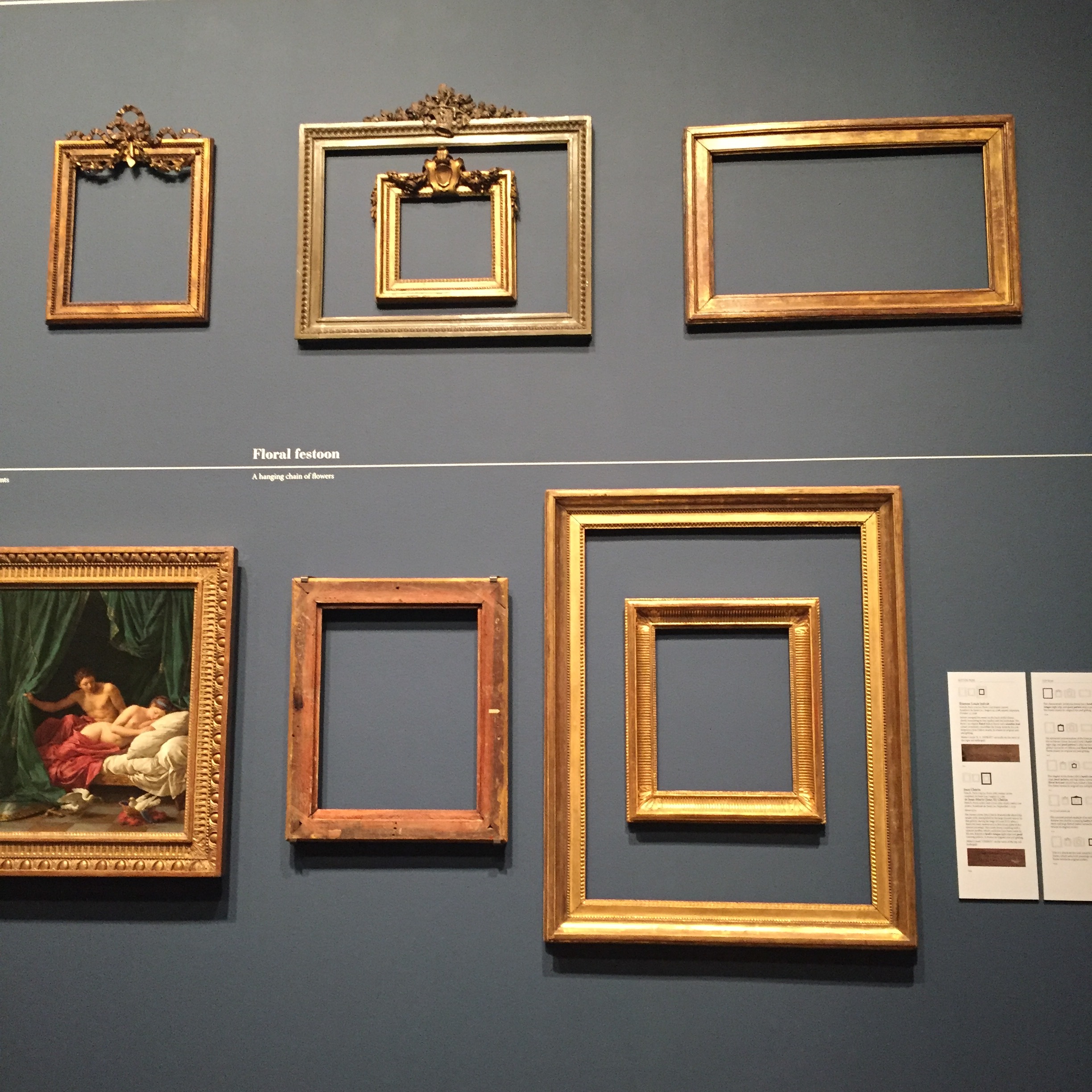
The survey concludes with Louis XVI style frames that embody the restraint of Neoclassical forms. Straight edges and linear geometric patterns celebrated antiquity and the recent archaeological discoveries of Herculaneum and Pompeii. The fluted cove style frame first appeared and gilded surfaces used the interplay of matte and burnished surfaces to striking effect.

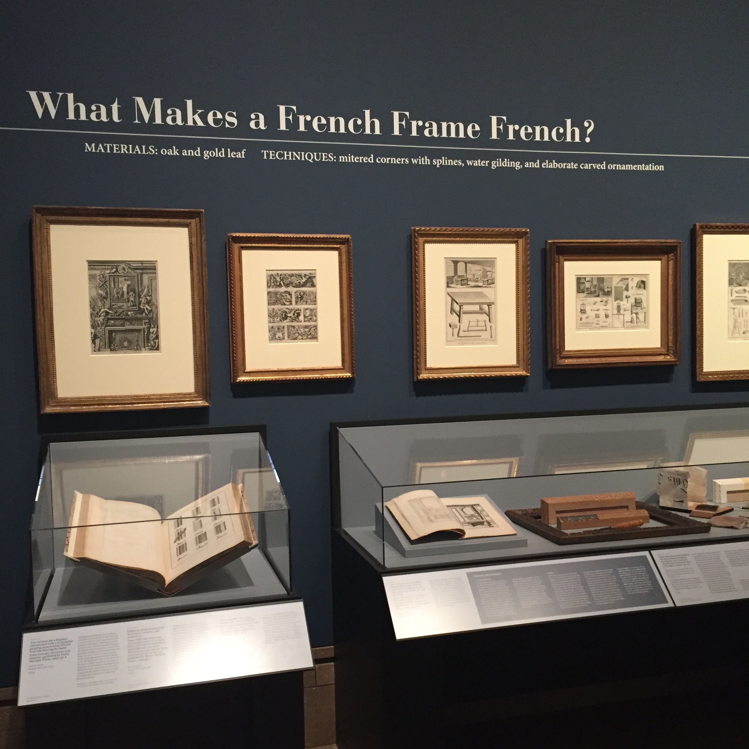
The final wall includes a didactic section showing tools of the carver and gilder, and images from pattern books and Diderot’s Encyclopedia.


Tools, pattern books and images from Diderot's Encyclopedia.


There’s even a small tablet that allows you to look at four different artworks in several different frame styles to get a feel for what works and what doesn’t.  It’s a wonderful glimpse into the artistry of gifted craftsmen.